> ## Documentation Index
> Fetch the complete documentation index at: https://cometchat-22654f5b-docs-react-v7-feature-guides.mintlify.site/llms.txt
> Use this file to discover all available pages before exploring further.
# Customizing Message Bubbles
> Customize CometChat Flutter UI Kit message bubbles with incoming and outgoing styles, theme extensions, reactions, timestamps, and avatars.
The CometChat V6 UI Kit provides `CometChatOutgoingMessageBubbleStyle` and `CometChatIncomingMessageBubbleStyle` for fine-grained control over message bubble appearance. These classes extend `ThemeExtension`, allowing customizations through global theming or explicit style objects.
## How These Classes Help
### 1. Targeted Customization
Customize specific attributes of message bubbles:
* Background color, border radius, text style
* Specialized bubbles: Audio, File, Collaborative, Poll, Deleted, Link Preview, Sticker, Call bubbles
* Reactions, timestamps, avatars, and borders
### 2. Unified Global Theming
Apply styles via Flutter's global theming or pass them to `CometChatMessageListStyle`:
```dart theme={null}
MaterialApp(
title: 'Your app',
theme: ThemeData(
extensions: [
CometChatIncomingMessageBubbleStyle(
backgroundColor: Color(0xFFF76808),
),
CometChatOutgoingMessageBubbleStyle(
backgroundColor: Color(0xFFF76808),
),
],
),
home: ...,
);
```
### 3. Ease of Integration
Pass styles directly to `CometChatMessageList`:
```dart theme={null}
CometChatMessageList(
user: user,
group: group,
style: CometChatMessageListStyle(
incomingMessageBubbleStyle: CometChatIncomingMessageBubbleStyle(),
outgoingMessageBubbleStyle: CometChatOutgoingMessageBubbleStyle(),
),
)
```
## Customizable Message Bubbles
### Text Bubble
```dart theme={null}
ThemeData(
extensions: [
CometChatOutgoingMessageBubbleStyle(
textBubbleStyle: CometChatTextBubbleStyle(
backgroundColor: Color(0xFFF76808),
),
),
CometChatIncomingMessageBubbleStyle(
textBubbleStyle: CometChatTextBubbleStyle(
backgroundColor: Color(0xFFFEEDE1),
),
),
],
)
```
### Image Bubble
```dart theme={null}
ThemeData(
extensions: [
CometChatOutgoingMessageBubbleStyle(
imageBubbleStyle: CometChatImageBubbleStyle(
backgroundColor: Color(0xFFF76808),
),
),
CometChatIncomingMessageBubbleStyle(
imageBubbleStyle: CometChatImageBubbleStyle(
backgroundColor: Color(0xFFFEEDE1),
),
),
],
)
```
### Video Bubble
```dart theme={null}
ThemeData(
extensions: [
CometChatOutgoingMessageBubbleStyle(
videoBubbleStyle: CometChatVideoBubbleStyle(
backgroundColor: Color(0xFFF76808),
playIconColor: Color(0xFFF76808),
),
),
CometChatIncomingMessageBubbleStyle(
videoBubbleStyle: CometChatVideoBubbleStyle(
backgroundColor: Color(0xFFFEEDE1),
playIconColor: Color(0xFFF76808),
),
),
],
)
```
### Voice Note Bubble
Styles the voice-note (recorded audio) bubble via `voiceNoteBubbleStyle` and `CometChatVoiceNoteBubbleStyle`.
```dart theme={null}
ThemeData(
extensions: [
CometChatOutgoingMessageBubbleStyle(
voiceNoteBubbleStyle: CometChatVoiceNoteBubbleStyle(
backgroundColor: Color(0xFFF76808),
playIconColor: Color(0xFFF76808),
),
),
CometChatIncomingMessageBubbleStyle(
voiceNoteBubbleStyle: CometChatVoiceNoteBubbleStyle(
backgroundColor: Color(0xFFFEEDE1),
downloadIconColor: Color(0xFFF76808),
audioBarColor: Color(0xFFF76808),
playIconColor: Color(0xFFF76808),
),
),
],
)
```
The older `audioBubbleStyle` / `CometChatAudioBubbleStyle` names are deprecated aliases of `voiceNoteBubbleStyle` / `CometChatVoiceNoteBubbleStyle` and still work, but prefer the voice-note names.
### File Bubble
```dart theme={null}
ThemeData(
extensions: [
CometChatOutgoingMessageBubbleStyle(
fileBubbleStyle: CometChatFileBubbleStyle(
backgroundColor: Color(0xFFF76808),
),
),
CometChatIncomingMessageBubbleStyle(
fileBubbleStyle: CometChatFileBubbleStyle(
backgroundColor: Color(0xFFFEEDE1),
downloadIconTint: Color(0xFFF76808),
),
),
],
)
```
### Sticker Bubble
```dart theme={null}
ThemeData(
extensions: [
CometChatOutgoingMessageBubbleStyle(
stickerBubbleStyle: CometChatStickerBubbleStyle(
backgroundColor: Color(0xFFF76808),
),
),
CometChatIncomingMessageBubbleStyle(
stickerBubbleStyle: CometChatStickerBubbleStyle(
backgroundColor: Color(0xFFFEEDE1),
),
),
],
)
```
### Call Bubble
```dart theme={null}
ThemeData(
extensions: [
CometChatOutgoingMessageBubbleStyle(
videoCallBubbleStyle: CometChatCallBubbleStyle(
backgroundColor: Color(0xFFF76808),
iconColor: Color(0xFFF76808),
buttonTextStyle: TextStyle(color: Colors.white),
dividerColor: Color(0xFFFBAA75),
),
),
CometChatIncomingMessageBubbleStyle(
videoCallBubbleStyle: CometChatCallBubbleStyle(
backgroundColor: Color(0xFFFEEDE1),
iconColor: Color(0xFFF76808),
buttonTextStyle: TextStyle(color: Color(0xFFF76808)),
),
),
],
)
```
### Collaborative Whiteboard Bubble
```dart theme={null}
ThemeData(
extensions: [
CometChatOutgoingMessageBubbleStyle(
collaborativeWhiteboardBubbleStyle: CometChatCollaborativeBubbleStyle(
backgroundColor: Color(0xFFF76808),
iconTint: Color(0xFFFFFFFF),
titleStyle: TextStyle(fontWeight: FontWeight.bold, color: Color(0xFFFFFFFF)),
buttonTextStyle: TextStyle(color: Color(0xFFFFFFFF)),
dividerColor: Color(0xFFFBAA75),
),
),
CometChatIncomingMessageBubbleStyle(
collaborativeWhiteboardBubbleStyle: CometChatCollaborativeBubbleStyle(
backgroundColor: Color(0xFFFEEDE1),
iconTint: Color(0xFFF76808),
titleStyle: TextStyle(fontWeight: FontWeight.bold),
buttonTextStyle: TextStyle(color: Color(0xFFF76808)),
),
),
],
)
```
### Collaborative Document Bubble
```dart theme={null}
ThemeData(
extensions: [
CometChatOutgoingMessageBubbleStyle(
collaborativeDocumentBubbleStyle: CometChatCollaborativeBubbleStyle(
backgroundColor: Color(0xFFF76808),
iconTint: Color(0xFFFFFFFF),
titleStyle: TextStyle(fontWeight: FontWeight.bold, color: Color(0xFFFFFFFF)),
buttonTextStyle: TextStyle(color: Color(0xFFFFFFFF)),
dividerColor: Color(0xFFFBAA75),
),
),
CometChatIncomingMessageBubbleStyle(
collaborativeDocumentBubbleStyle: CometChatCollaborativeBubbleStyle(
backgroundColor: Color(0xFFFEEDE1),
iconTint: Color(0xFFF76808),
titleStyle: TextStyle(fontWeight: FontWeight.bold),
buttonTextStyle: TextStyle(color: Color(0xFFF76808)),
),
),
],
)
```
### Poll Bubble
```dart theme={null}
ThemeData(
extensions: [
CometChatOutgoingMessageBubbleStyle(
pollsBubbleStyle: CometChatPollsBubbleStyle(
backgroundColor: Color(0xFFF76808),
progressBackgroundColor: Color(0xFFFBAA75),
iconColor: Color(0xFFF76808),
),
),
CometChatIncomingMessageBubbleStyle(
pollsBubbleStyle: CometChatPollsBubbleStyle(
backgroundColor: Color(0xFFFEEDE1),
progressBackgroundColor: Color(0xFFDCDCDC),
progressColor: Color(0xFFF76808),
iconColor: Colors.white,
selectedOptionColor: Color(0xFFF76808),
),
),
],
)
```
### Link Preview Bubble
```dart theme={null}
ThemeData(
extensions: [
CometChatOutgoingMessageBubbleStyle(
linkPreviewBubbleStyle: CometChatLinkPreviewBubbleStyle(
backgroundColor: Color(0xFFFBAA75),
),
textBubbleStyle: CometChatTextBubbleStyle(
backgroundColor: Color(0xFFF76808),
),
),
CometChatIncomingMessageBubbleStyle(
linkPreviewBubbleStyle: CometChatLinkPreviewBubbleStyle(
backgroundColor: Color(0xFFFBAA75),
),
textBubbleStyle: CometChatTextBubbleStyle(
backgroundColor: Color(0xFFFEEDE1),
),
),
],
)
```
### Action Message Bubble
```dart theme={null}
ThemeData(
extensions: [
CometChatActionBubbleStyle(
textStyle: TextStyle(color: Color(0xFFF76808)),
border: Border.all(color: Color(0xFFF76808)),
backgroundColor: Color(0xFFFEEDE1),
),
],
)
```
### Deleted Message Bubble
```dart theme={null}
ThemeData(
extensions: [
CometChatOutgoingMessageBubbleStyle(
deletedBubbleStyle: CometChatDeletedBubbleStyle(
backgroundColor: Color(0xFFF76808),
),
),
CometChatIncomingMessageBubbleStyle(
deletedBubbleStyle: CometChatDeletedBubbleStyle(
backgroundColor: Color(0xFFFEEDE1),
),
),
],
)
```
### AI Assistant Bubble
```dart theme={null}
ThemeData(
extensions: [
CometChatAiAssistantBubbleStyle(
backgroundColor: Colors.transparent,
textColor: const Color(0xFF141414),
),
],
)
```
## Multiple Attachments
When `enableMultipleAttachments` is on, a message's images / videos / audio files / documents render through dedicated **multi-attachment** bubbles. These are styled differently from the single-attachment bubbles above: each has its own `ThemeExtension` class that you register **directly** in `ThemeData.extensions` — they are *not* nested inside `CometChatIncomingMessageBubbleStyle` / `CometChatOutgoingMessageBubbleStyle`.
```dart theme={null}
ThemeData(
extensions: [
CometChatImagesBubbleStyle(placeholderColor: Color(0xFFFEEDE1)),
CometChatVideosBubbleStyle(playIconColor: Color(0xFFF76808)),
CometChatAudiosBubbleStyle(playIconColor: Color(0xFFF76808)),
CometChatFilesBubbleStyle(backgroundColor: Color(0xFFFEEDE1)),
],
)
```
Both families can coexist. The single-attachment `imageBubbleStyle` / `videoBubbleStyle` / `voiceNoteBubbleStyle` / `fileBubbleStyle` apply when a message carries one attachment (or when multiple attachments are disabled); the classes below apply to the multi-attachment grids and lists.
### Images Bubble — `CometChatImagesBubbleStyle`
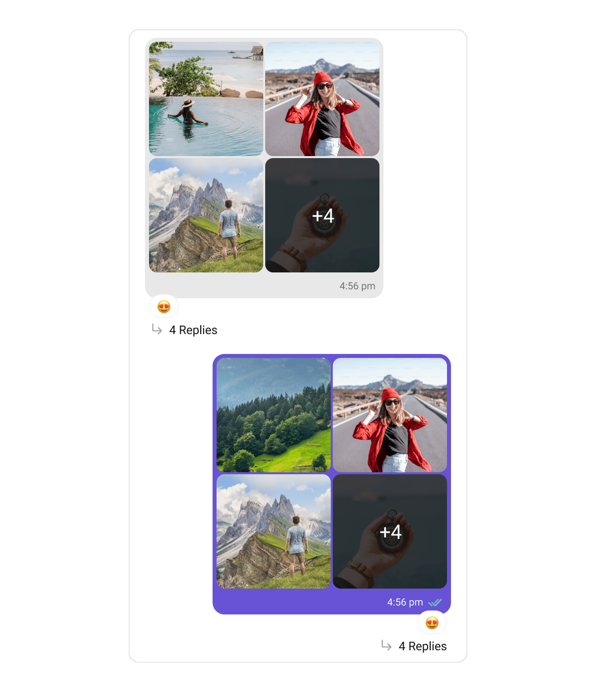 The count-based image grid (1 / 2 / 3 / 4 / 5+ with a "+N" overflow tile).
| Property | Description |
| -------------------- | ----------------------------------------------------------------- |
| `tileBorderRadius` | Corner radius of each image tile. |
| `gridSpacing` | Gap between tiles. |
| `placeholderColor` | Fill shown while a tile loads, and behind the "no preview" glyph. |
| `overflowScrimColor` | Scrim over the "+N" tile when there are more images than cells. |
| `overflowTextStyle` | Text style of the "+N" count. |
| `captionTextStyle` | Text style of the caption below the grid. |
### Videos Bubble — `CometChatVideosBubbleStyle`
The count-based image grid (1 / 2 / 3 / 4 / 5+ with a "+N" overflow tile).
| Property | Description |
| -------------------- | ----------------------------------------------------------------- |
| `tileBorderRadius` | Corner radius of each image tile. |
| `gridSpacing` | Gap between tiles. |
| `placeholderColor` | Fill shown while a tile loads, and behind the "no preview" glyph. |
| `overflowScrimColor` | Scrim over the "+N" tile when there are more images than cells. |
| `overflowTextStyle` | Text style of the "+N" count. |
| `captionTextStyle` | Text style of the caption below the grid. |
### Videos Bubble — `CometChatVideosBubbleStyle`
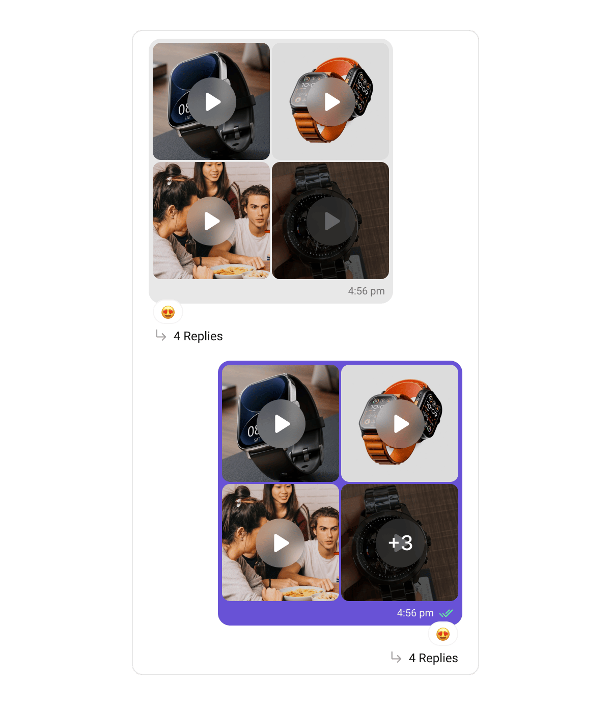 The video grid — poster frames under a play badge, with an optional duration chip.
| Property | Description |
| ------------------------------------------ | --------------------------------------- |
| `tileBorderRadius` | Corner radius of each video tile. |
| `gridSpacing` | Gap between tiles. |
| `placeholderColor` | Poster placeholder fill. |
| `playIconBackgroundColor` | Background of the centered play badge. |
| `playIconColor` | Play glyph colour. |
| `nameTextStyle` | Text style for a video's name label. |
| `durationChipBackgroundColor` | Background of the `m:ss` duration pill. |
| `durationChipTextStyle` | Duration-pill text style. |
| `showVideoDuration` | Whether to show the duration chip. |
| `overflowScrimColor` / `overflowTextStyle` | The "+N" overflow tile. |
| `captionTextStyle` | Caption text style. |
### Audios Bubble — `CometChatAudiosBubbleStyle`
The video grid — poster frames under a play badge, with an optional duration chip.
| Property | Description |
| ------------------------------------------ | --------------------------------------- |
| `tileBorderRadius` | Corner radius of each video tile. |
| `gridSpacing` | Gap between tiles. |
| `placeholderColor` | Poster placeholder fill. |
| `playIconBackgroundColor` | Background of the centered play badge. |
| `playIconColor` | Play glyph colour. |
| `nameTextStyle` | Text style for a video's name label. |
| `durationChipBackgroundColor` | Background of the `m:ss` duration pill. |
| `durationChipTextStyle` | Duration-pill text style. |
| `showVideoDuration` | Whether to show the duration chip. |
| `overflowScrimColor` / `overflowTextStyle` | The "+N" overflow tile. |
| `captionTextStyle` | Caption text style. |
### Audios Bubble — `CometChatAudiosBubbleStyle`
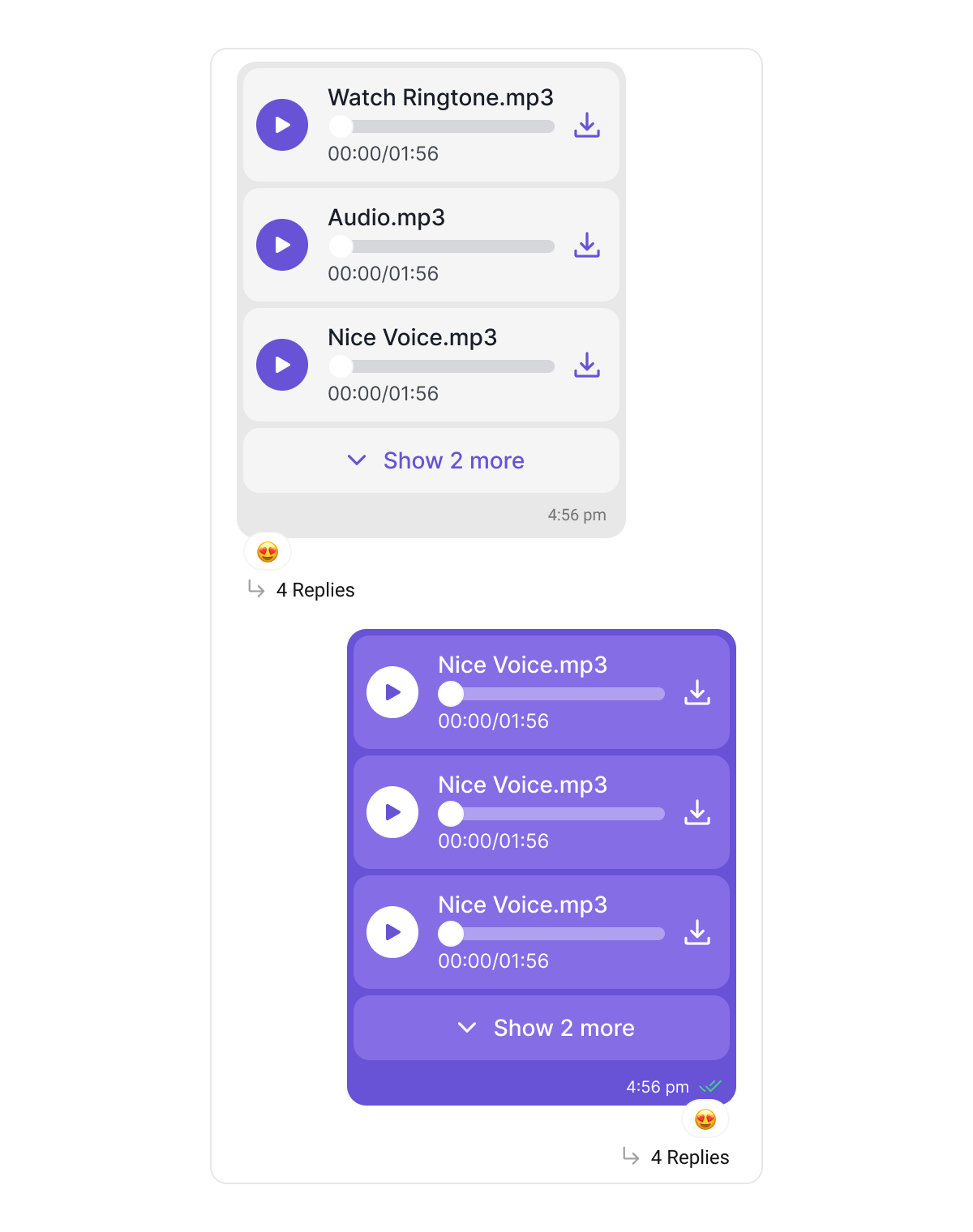 The stack of inline audio-file player rows (picked audio files, not voice notes).
| Property | Description |
| ---------------------------------------------------------------- | ------------------------------ |
| `rowBackgroundColor` | Background of each player row. |
| `rowBorderRadius` | Row corner radius. |
| `rowSpacing` | Gap between rows. |
| `playIconBackgroundColor` | Play/pause circle background. |
| `playIconColor` | Play/pause glyph colour. |
| `sliderActiveColor` / `sliderInactiveColor` / `sliderThumbColor` | Seek-bar colours. |
| `nameTextStyle` | File-name text style. |
| `durationTextStyle` | Elapsed/total time text style. |
| `downloadIconColor` | Download icon colour. |
| `captionTextStyle` | Caption text style. |
### Files Bubble — `CometChatFilesBubbleStyle`
The stack of inline audio-file player rows (picked audio files, not voice notes).
| Property | Description |
| ---------------------------------------------------------------- | ------------------------------ |
| `rowBackgroundColor` | Background of each player row. |
| `rowBorderRadius` | Row corner radius. |
| `rowSpacing` | Gap between rows. |
| `playIconBackgroundColor` | Play/pause circle background. |
| `playIconColor` | Play/pause glyph colour. |
| `sliderActiveColor` / `sliderInactiveColor` / `sliderThumbColor` | Seek-bar colours. |
| `nameTextStyle` | File-name text style. |
| `durationTextStyle` | Elapsed/total time text style. |
| `downloadIconColor` | Download icon colour. |
| `captionTextStyle` | Caption text style. |
### Files Bubble — `CometChatFilesBubbleStyle`
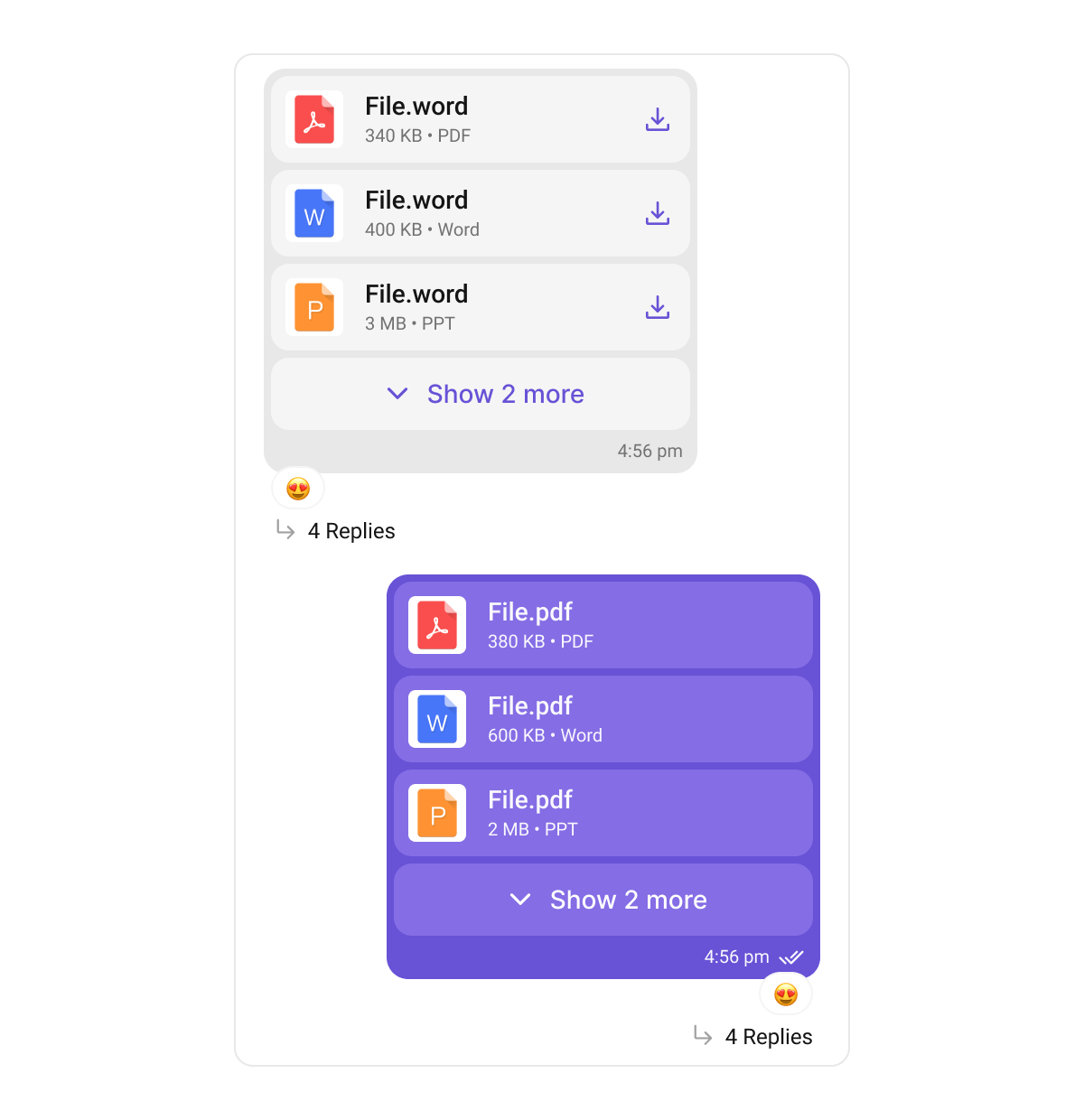 The list of document/file cards (icon + name + download).
| Property | Description |
| ------------------- | ---------------------------------------------------- |
| `backgroundColor` | File-card background. |
| `cardBorderRadius` | Card corner radius. |
| `cardSpacing` | Gap between cards. |
| `iconPlateColor` | Background plate behind the file-type icon. |
| `titleTextStyle` | File-name text style. |
| `subtitleTextStyle` | Size / type line text style. |
| `downloadIconTint` | Download icon tint. |
| `toggleTextStyle` | "Show more / less" toggle text style (for 4+ files). |
| `captionTextStyle` | Caption text style. |
### Media Grid — `CometChatMediaGridStyle`
The lower-level grid the **Images** and **Videos** bubbles build on. Most apps style via the two bubble classes above; register `CometChatMediaGridStyle` directly only to control the grid layer everywhere at once.
| Property | Description |
| ------------------------------------------------------- | -------------------------------------------------------------- |
| `cellBorderRadius` | Grid-cell corner radius. |
| `placeholderColor` | Cell placeholder fill. |
| `playBadgeBackgroundColor` / `playBadgeIconColor` | Video play badge. |
| `durationChipBackgroundColor` / `durationChipTextStyle` | Duration pill. |
| `nameTextStyle` | Cell name text style. |
| `overflowScrimColor` / `overflowTextStyle` | The "+N" overflow tile. |
| `showVideoDuration` | Whether to show duration chips. |
| `tripleLayout` | Arrangement for a 3-item grid (`auto` / hero-top / hero-left). |
| `heroFraction` | The hero cell's share of a 3-item grid. |
The list of document/file cards (icon + name + download).
| Property | Description |
| ------------------- | ---------------------------------------------------- |
| `backgroundColor` | File-card background. |
| `cardBorderRadius` | Card corner radius. |
| `cardSpacing` | Gap between cards. |
| `iconPlateColor` | Background plate behind the file-type icon. |
| `titleTextStyle` | File-name text style. |
| `subtitleTextStyle` | Size / type line text style. |
| `downloadIconTint` | Download icon tint. |
| `toggleTextStyle` | "Show more / less" toggle text style (for 4+ files). |
| `captionTextStyle` | Caption text style. |
### Media Grid — `CometChatMediaGridStyle`
The lower-level grid the **Images** and **Videos** bubbles build on. Most apps style via the two bubble classes above; register `CometChatMediaGridStyle` directly only to control the grid layer everywhere at once.
| Property | Description |
| ------------------------------------------------------- | -------------------------------------------------------------- |
| `cellBorderRadius` | Grid-cell corner radius. |
| `placeholderColor` | Cell placeholder fill. |
| `playBadgeBackgroundColor` / `playBadgeIconColor` | Video play badge. |
| `durationChipBackgroundColor` / `durationChipTextStyle` | Duration pill. |
| `nameTextStyle` | Cell name text style. |
| `overflowScrimColor` / `overflowTextStyle` | The "+N" overflow tile. |
| `showVideoDuration` | Whether to show duration chips. |
| `tripleLayout` | Arrangement for a 3-item grid (`auto` / hero-top / hero-left). |
| `heroFraction` | The hero cell's share of a 3-item grid. |