> ## Documentation Index
> Fetch the complete documentation index at: https://cometchat-22654f5b-docs-react-v7-feature-guides.mintlify.site/llms.txt
> Use this file to discover all available pages before exploring further.

# Groups

> Searchable, scrollable list of groups with selection support and real-time membership updates.

<Accordion title="AI Integration Quick Reference">
  | Field                     | Value                                                                                                                                                                                                             |
  | ------------------------- | ----------------------------------------------------------------------------------------------------------------------------------------------------------------------------------------------------------------- |
  | Component                 | `CometChatGroups`                                                                                                                                                                                                 |
  | Package                   | `@cometchat/chat-uikit-react`                                                                                                                                                                                     |
  | Import                    | `import { CometChatGroups } from "@cometchat/chat-uikit-react";`                                                                                                                                                  |
  | CSS root class            | `.cometchat-groups`                                                                                                                                                                                               |
  | Primary output            | `onItemClick: (group: CometChat.Group) => void` — emits the selected group to open                                                                                                                                |
  | Prerequisites             | App wrapped in [`CometChatProvider`](/ui-kit/react/cometchat-provider) with valid credentials + a logged-in user                                                                                                  |
  | Stitching                 | Emits the selected group; wire `onItemClick` to open it (mount MessageHeader/List/Composer) — see the [New Chat Creation guide](/ui-kit/react/guide-new-chat-creation)                                            |
  | Events received           | `ui:group/created`, `ui:group/deleted`, `ui:group/left`, and `ui:group/member-*` / `ui:group/ownership-changed` — keeps the list in sync — see the [Event System](/ui-kit/react/event-system#user--group-actions) |
  | SDK listeners (automatic) | Group membership changes — handled internally                                                                                                                                                                     |
  | Full props                | See [Props](#props)                                                                                                                                                                                               |
</Accordion>

## Overview

`CometChatGroups` is a list component that renders all available groups in the app. It emits the selected `CometChat.Group` via `onItemClick`. Wire it to `CometChatMessages` or use it as a group picker in flows like "join group" or "group details."

<Info>
  **Live Preview** — interact with the default groups list.

  [Open in Storybook ↗](https://storybook.cometchat.io/react/?path=/story/components-groups-cometchat-groups--default)
</Info>

<iframe src="https://storybook.cometchat.io/react/iframe.html?id=components-groups-cometchat-groups--default&viewMode=story&shortcuts=false&singleStory=true" className="w-full rounded-xl" loading="lazy" style={{height: "700px", border: "1px solid #e0e0e0"}} title="CometChat Groups — Default" allow="clipboard-write" />

The component handles:

* Paginated fetching with infinite scroll
* Real-time membership updates (joins, leaves, kicks, bans)
* Search filtering
* Swipe/hover options
* Selection mode (single/multiple)

***

## Usage

### Flat API

```tsx theme={null}
import { CometChatGroups } from "@cometchat/chat-uikit-react";

function GroupList() {
  return (
    <CometChatGroups
      onItemClick={(group) => {
        console.log("Selected group:", group.getName());
      }}
    />
  );
}
```

### Compound Composition

```tsx theme={null}
import { CometChatGroups } from "@cometchat/chat-uikit-react";

function GroupList() {
  return (
    <CometChatGroups.Root onItemClick={handleClick}>
      <CometChatGroups.Header title="Groups" />
      <CometChatGroups.SearchBar placeholder="Search groups..." />
      <CometChatGroups.LoadingState />
      <CometChatGroups.ErrorState />
      <CometChatGroups.EmptyState>
        <p>No groups found. Create one!</p>
      </CometChatGroups.EmptyState>
      <CometChatGroups.List />
    </CometChatGroups.Root>
  );
}
```

### Full Layout Example

`onItemClick` is where you capture the selected group and mount the chat panel to open the group chat — see the [New Chat Creation guide](/ui-kit/react/guide-new-chat-creation) for the two-panel wiring and the [Group Chat Setup guide](/ui-kit/react/guide-group-chat-setup) for join/details flows.

```tsx theme={null}
import { useState } from "react";
import { CometChat } from "@cometchat/chat-sdk-javascript";
import {
  CometChatGroups,
  CometChatMessageHeader,
  CometChatMessageList,
  CometChatMessageComposer,
} from "@cometchat/chat-uikit-react";

function GroupChat() {
  const [group, setGroup] = useState<CometChat.Group | undefined>();

  return (
    <div style={{ display: "flex", height: "100vh" }}>
      <div style={{ width: 360 }}>
        <CometChatGroups onItemClick={(g) => setGroup(g)} activeGroup={group} />
      </div>
      {group && (
        <div style={{ flex: 1, display: "flex", flexDirection: "column" }}>
          <CometChatMessageHeader group={group} />
          <CometChatMessageList group={group} />
          <CometChatMessageComposer group={group} />
        </div>
      )}
    </div>
  );
}
```

***

## Filtering

Pass a `CometChat.GroupsRequestBuilder` to `groupsRequestBuilder` to control which groups load. Pass the builder instance — not the result of `.build()`. Refer to [GroupsRequestBuilder](/sdk/javascript/retrieve-groups) for the full builder API.

```tsx theme={null}
<CometChatGroups
  groupsRequestBuilder={
    new CometChat.GroupsRequestBuilder()
      .setLimit(15)
      .joinedOnly(true)
  }
/>
```

### Search

The component includes a built-in search bar. When the user types, it fetches matching groups from the server. For custom search behavior, pass a `searchRequestBuilder`:

```tsx theme={null}
<CometChatGroups
  searchRequestBuilder={
    new CometChat.GroupsRequestBuilder().setLimit(30).setSearchKeyword("")
  }
/>
```

### Filter Recipes

| Recipe              | Code                                                      |
| ------------------- | --------------------------------------------------------- |
| Only joined groups  | `new CometChat.GroupsRequestBuilder().joinedOnly(true)`   |
| Only public groups  | `new CometChat.GroupsRequestBuilder().setType("public")`  |
| Only private groups | `new CometChat.GroupsRequestBuilder().setType("private")` |
| Limit page size     | `new CometChat.GroupsRequestBuilder().setLimit(10)`       |
| With tags           | `new CometChat.GroupsRequestBuilder().setTags(["team"])`  |

***

## Actions and Events

### Callback Props

| Prop          | Signature                                                 | Fires when                                 |
| ------------- | --------------------------------------------------------- | ------------------------------------------ |
| `onItemClick` | `(group: CometChat.Group) => void`                        | User clicks a group item                   |
| `onSelect`    | `(group: CometChat.Group, selected: boolean) => void`     | Group selected/deselected (selection mode) |
| `onError`     | `((error: CometChat.CometChatException) => void) \| null` | SDK error occurs                           |
| `onEmpty`     | `() => void`                                              | List is empty after initial fetch          |

### Events Emitted

This component does not emit any UI events.

### Events Received

UI events this component subscribes to (published by other components). These flow through the shared UI event bus — see [Event System → User & Group Actions](/ui-kit/react/event-system#user--group-actions) for how these `ui:group/*` events are published.

| Event                           | Payload                                 | Behavior                                        |
| ------------------------------- | --------------------------------------- | ----------------------------------------------- |
| `ui:group/created`              | `{ group }`                             | Adds the new group to the list                  |
| `ui:group/deleted`              | `{ group }`                             | Removes the group from the list                 |
| `ui:group/left`                 | `{ group }`                             | Removes (private) or updates (public) the group |
| `ui:group/member-joined`        | `{ joinedGroup }`                       | Updates the group (member count)                |
| `ui:group/member-added`         | `{ group, members, messages }`          | Updates the group                               |
| `ui:group/member-kicked`        | `{ group, user, message }`              | Updates the group                               |
| `ui:group/member-banned`        | `{ group, user, message }`              | Updates the group                               |
| `ui:group/member-scope-changed` | `{ group, user, newScope }`             | Updates the group                               |
| `ui:group/ownership-changed`    | `{ group, newOwner, previousOwnerUid }` | Updates the group                               |

### SDK Listeners (Automatic)

These SDK listeners are attached internally. The component updates its state automatically — no manual subscription needed:

* Groups: `onGroupMemberJoined`, `onGroupMemberLeft`, `onGroupMemberKicked`, `onGroupMemberBanned`, `onMemberAddedToGroup`

***

## Customization

### View Props

Use view props to replace sections of the default UI while keeping the component's behavior intact:

```tsx theme={null}
<CometChatGroups
  headerView={<MyCustomHeader />}
  itemView={(group) => <MyCustomGroupItem group={group} />}
  emptyView={<EmptyState />}
  loadingView={<Skeleton />}
  errorView={<ErrorBanner />}
/>
```

| Slot           | Signature              | Replaces                           |
| -------------- | ---------------------- | ---------------------------------- |
| `itemView`     | `(group) => ReactNode` | Entire group row                   |
| `leadingView`  | `(group) => ReactNode` | Avatar section                     |
| `titleView`    | `(group) => ReactNode` | Group name                         |
| `subtitleView` | `(group) => ReactNode` | Member count / description         |
| `trailingView` | `(group) => ReactNode` | Trailing content (group type icon) |
| `headerView`   | `ReactNode`            | Header area                        |
| `loadingView`  | `ReactNode`            | Loading shimmer                    |
| `emptyView`    | `ReactNode`            | Empty state                        |
| `errorView`    | `ReactNode`            | Error state                        |

#### itemView

Replace the entire list item row.

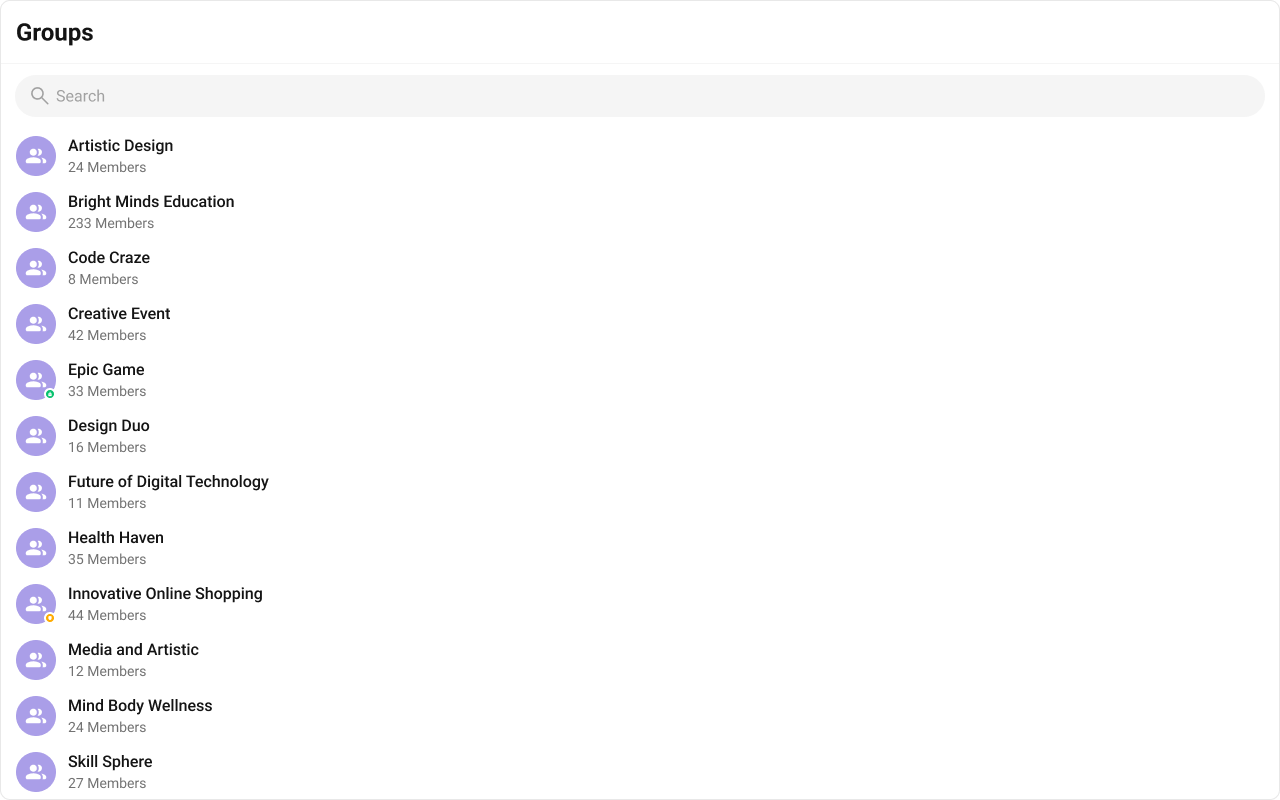
Default:

<Frame>
  <img src="https://mintcdn.com/cometchat-22654f5b-docs-react-v7-feature-guides/njjxJbyNLP3ELQ0X/images/d7c86ab4-groups_listItemView_default_web_screens-76f09cda3f72c774c46829a547f37f3d.png?fit=max&auto=format&n=njjxJbyNLP3ELQ0X&q=85&s=4b3243626aa6d3300c9b426f4505d124" width="1280" height="800" data-path="images/d7c86ab4-groups_listItemView_default_web_screens-76f09cda3f72c774c46829a547f37f3d.png" />
</Frame>

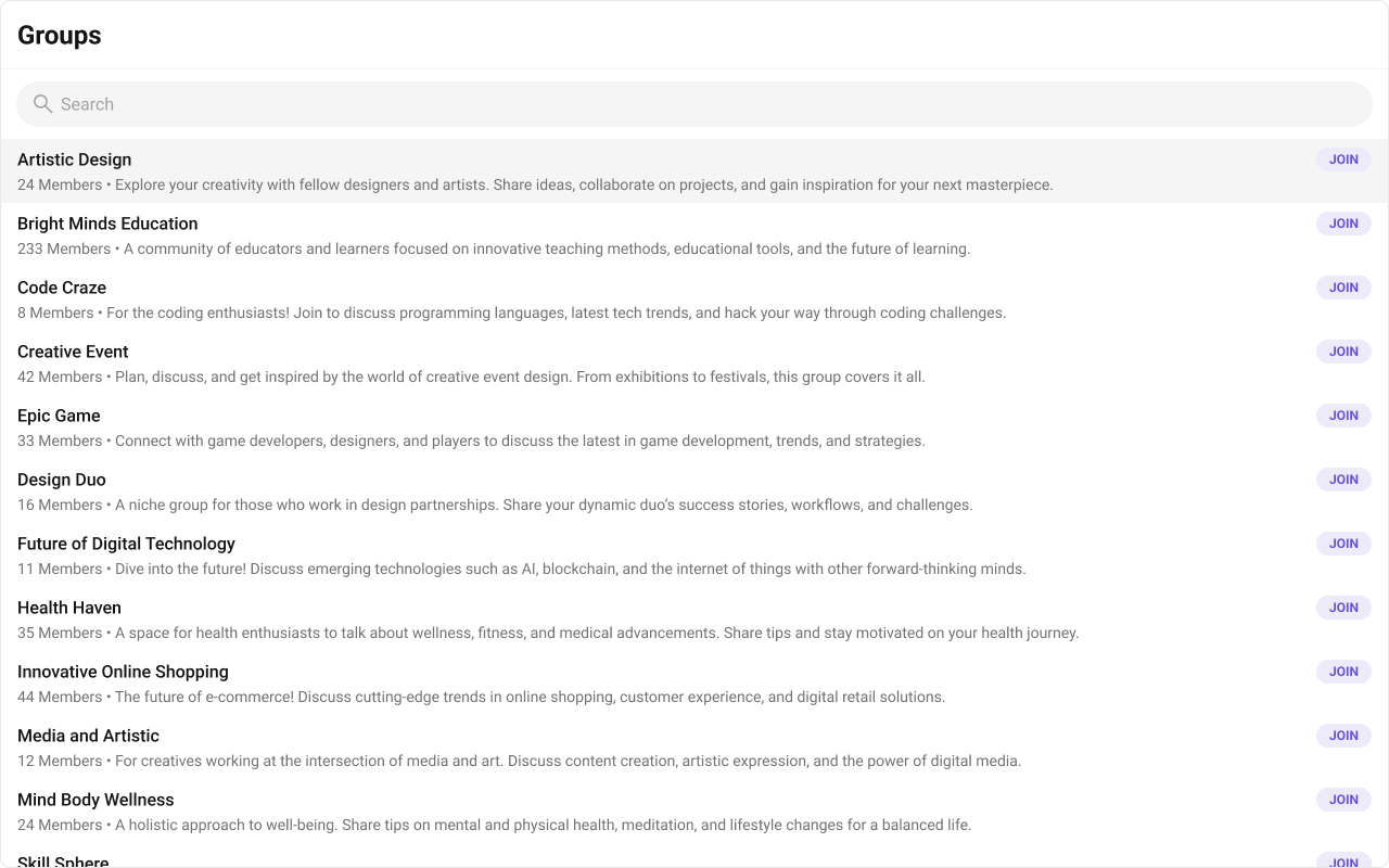
Customized:

<Frame>
  <img src="https://mintcdn.com/cometchat-22654f5b-docs-react-v7-feature-guides/rNh1qkC7lQsH3jv9/images/2c6dea55-groups_listItemView_custom_web_screens-a982a860cd750f68bb9409701f0e2267.png?fit=max&auto=format&n=rNh1qkC7lQsH3jv9&q=85&s=e81d8f071bb90aef530529f340e2cf39" width="1280" height="800" data-path="images/2c6dea55-groups_listItemView_custom_web_screens-a982a860cd750f68bb9409701f0e2267.png" />
</Frame>

<Tabs>
  <Tab title="TypeScript">
    ```tsx theme={null}
    import { CometChat } from "@cometchat/chat-sdk-javascript";
    import { CometChatGroups } from "@cometchat/chat-uikit-react";

    function CustomItemViewGroups() {
      const getItemView = (group: CometChat.Group) => {
        return (
          <div className="group-list-item">
            <div className="group-list-item__title-wrapper">
              <div className="group-list-item__title">{group.getName()}</div>
              <div className="group-list-item__tail">JOIN</div>
            </div>
            <div className="group-list-item__subtitle">
              {group.getMembersCount()} Members • {group.getDescription()}
            </div>
          </div>
        );
      };

      return <CometChatGroups itemView={getItemView} />;
    }
    ```
  </Tab>

  <Tab title="CSS">
    ```css theme={null}
    .group-list-item {
      display: flex;
      flex-direction: column;
      text-align: left;
      min-width: 240px;
      padding: 8px 16px;
      gap: 4px;
      flex: 1 0 0;
      border-right: 1px solid #f5f5f5;
      background: #fff;
    }

    .group-list-item:hover {
      background-color: #f5f5f5;
    }

    .group-list-item__title-wrapper {
      display: flex;
      justify-content: space-between;
      align-items: center;
      align-self: stretch;
    }

    .group-list-item__title {
      overflow: hidden;
      color: #141414;
      text-overflow: ellipsis;
      font: 500 16px Roboto;
    }

    .group-list-item__tail {
      display: flex;
      padding: 4px 12px;
      justify-content: center;
      align-items: center;
      border-radius: 1000px;
      background: #edeafa;
      overflow: hidden;
      color: #6852d6;
      text-overflow: ellipsis;
      font: 700 12px Roboto;
    }

    .group-list-item__subtitle {
      overflow: hidden;
      color: #727272;
      text-overflow: ellipsis;
      white-space: nowrap;
      font: 400 14px Roboto;
    }
    ```
  </Tab>
</Tabs>

#### titleView

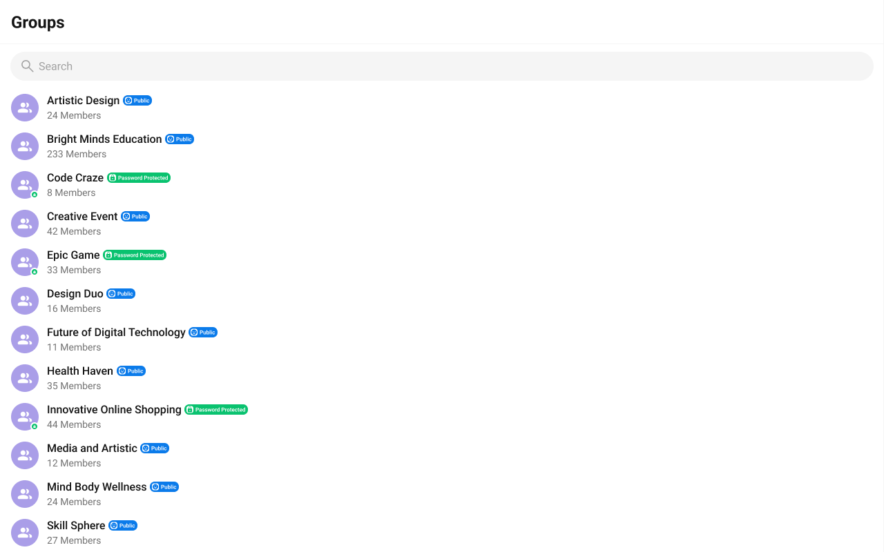
Replace the name / title text. Group type badge inline example.

<Frame>
  <img src="https://mintcdn.com/cometchat-22654f5b-docs-react-v7-feature-guides/Uj5mf3HWvDiTfI9x/images/1407ea86-groups_custom_titleview_web_screens-54ca7045e948a252b07729ffc10dbc15.png?fit=max&auto=format&n=Uj5mf3HWvDiTfI9x&q=85&s=c3aefab33e6abb47c59140e692a10e11" width="1280" height="800" data-path="images/1407ea86-groups_custom_titleview_web_screens-54ca7045e948a252b07729ffc10dbc15.png" />
</Frame>

<Tabs>
  <Tab title="TypeScript">
    ```tsx theme={null}
    import { CometChat } from "@cometchat/chat-sdk-javascript";
    import { CometChatGroups } from "@cometchat/chat-uikit-react";

    function GroupTypeTitleGroups() {
      const getTitleView = (group: CometChat.Group) => {
        return (
          <div className={`groups__title-view groups__title-view-${group.getType()}`}>
            <span className="groups__title-view-name">{group.getName()}</span>
            <span className="groups__title-view-type">{group.getType()}</span>
          </div>
        );
      };

      return <CometChatGroups titleView={getTitleView} />;
    }
    ```
  </Tab>

  <Tab title="CSS">
    ```css theme={null}
    .groups__title-view {
      display: flex;
      align-items: center;
      gap: 4px;
      align-self: stretch;
    }

    .groups__title-view-name {
      overflow: hidden;
      color: #141414;
      text-overflow: ellipsis;
      font: 500 16px Roboto;
    }

    .groups__title-view-type {
      color: #fff;
      font: 600 8px Roboto;
      display: flex;
      height: 15px;
      padding: 1px 3px;
      justify-content: center;
      align-items: center;
      gap: 4px;
      border-radius: 7px;
      background: #09c26f;
    }

    .groups__title-view-public .groups__title-view-type {
      background: #0b7bea;
    }
    ```
  </Tab>
</Tabs>

#### subtitleView

Replace the member count subtitle text.

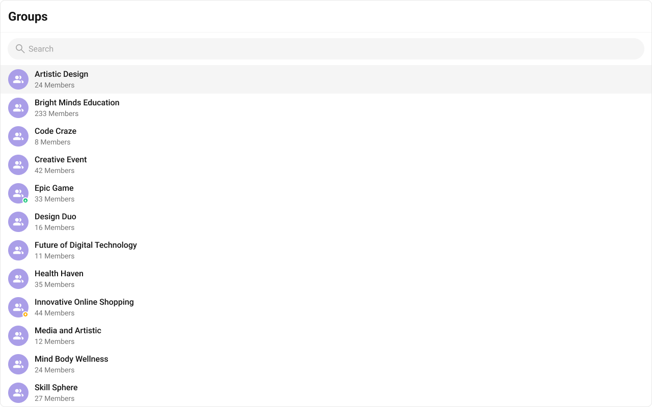
Default:

<Frame>
  <img src="https://mintcdn.com/cometchat-22654f5b-docs-react-v7-feature-guides/H4uKB0IeAGXzGRgV/images/fc8a44f2-groups_subtitleView_default_web_screens-ce55d4824eab1d506f7ff5b8b2bd3f03.png?fit=max&auto=format&n=H4uKB0IeAGXzGRgV&q=85&s=8b0975fb87299722d078eed8a527d351" width="1280" height="800" data-path="images/fc8a44f2-groups_subtitleView_default_web_screens-ce55d4824eab1d506f7ff5b8b2bd3f03.png" />
</Frame>

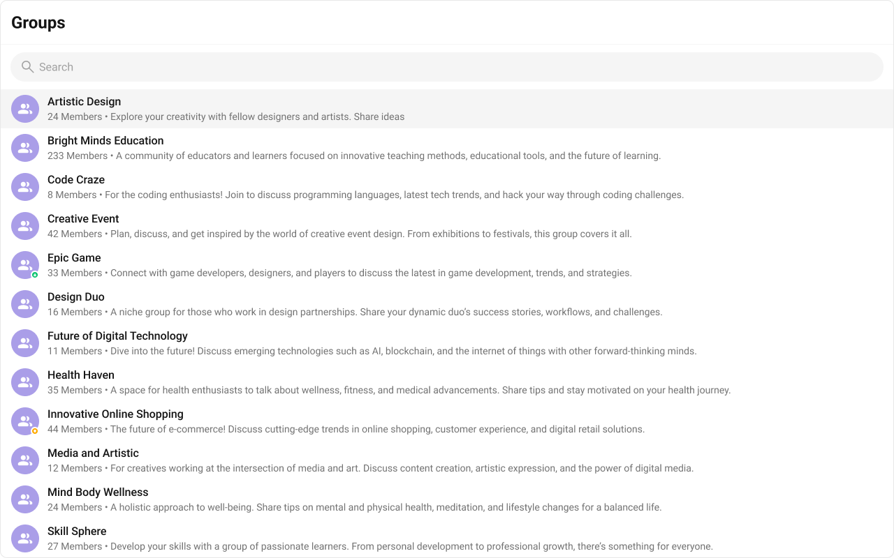
Customized:

<Frame>
  <img src="https://mintcdn.com/cometchat-22654f5b-docs-react-v7-feature-guides/njjxJbyNLP3ELQ0X/images/d7df2f29-groups_subtitleView_custom_web_screens-2031bc808b39482f08506ce198d5dd36.png?fit=max&auto=format&n=njjxJbyNLP3ELQ0X&q=85&s=5ac092941220ef114bdac73f5b9c55cd" width="1280" height="800" data-path="images/d7df2f29-groups_subtitleView_custom_web_screens-2031bc808b39482f08506ce198d5dd36.png" />
</Frame>

<Tabs>
  <Tab title="TypeScript">
    ```tsx theme={null}
    import { CometChat } from "@cometchat/chat-sdk-javascript";
    import { CometChatGroups } from "@cometchat/chat-uikit-react";

    function SubtitleGroups() {
      const getSubtitleView = (group: CometChat.Group) => {
        return (
          <div className="group-subtitle">
            {group.getMembersCount()} Members • {group.getDescription()}
          </div>
        );
      };

      return <CometChatGroups subtitleView={getSubtitleView} />;
    }
    ```
  </Tab>

  <Tab title="CSS">
    ```css theme={null}
    .cometchat-groups .group-subtitle {
      overflow: hidden;
      color: #727272;
      text-overflow: ellipsis;
      white-space: nowrap;
      font: 400 14px Roboto;
    }
    ```
  </Tab>
</Tabs>

### Compound Composition

For full layout control, use sub-components. Omit any sub-component to hide it:

```tsx theme={null}
<CometChatGroups.Root onItemClick={handleClick}>
  {/* No Header or SearchBar — they won't render */}
  <CometChatGroups.List />
</CometChatGroups.Root>
```

Available sub-components:

| Sub-component  | Description                    | Props                                                      | Flat API equivalent |
| -------------- | ------------------------------ | ---------------------------------------------------------- | ------------------- |
| `Root`         | Context provider and container | All Root props + `children`                                | —                   |
| `List`         | Scrollable group list          | `itemView`                                                 | `itemView`          |
| `Item`         | Individual group row           | `leadingView`, `titleView`, `subtitleView`, `trailingView` | Per-item view props |
| `Header`       | Header area                    | `title`, `children`                                        | `headerView`        |
| `SearchBar`    | Search input                   | `placeholder`                                              | —                   |
| `EmptyState`   | Empty state                    | `children`                                                 | `emptyView`         |
| `ErrorState`   | Error state                    | `children`                                                 | `errorView`         |
| `LoadingState` | Loading shimmer                | `children`                                                 | `loadingView`       |

### CSS Styling

Override design tokens on the component selector:

```css theme={null}
.cometchat-groups {
  --cometchat-background-color-01: #1a1a2e;
  --cometchat-text-color-primary: #ffffff;
}

.cometchat-groups__item--active {
  background: var(--cometchat-primary-color);
}
```

***

## Props

All props are optional.

<Note>
  View slot props (`headerView`, `loadingView`, `emptyView`, `errorView`, `itemView`, `leadingView`, `titleView`, `subtitleView`, `trailingView`) are convenience props available only on the flat API. The search input is the `SearchBar` sub-component (with a `placeholder` prop), not a view slot. In compound composition mode, use the corresponding sub-components directly.
</Note>

***

### groupsRequestBuilder

Custom request builder for fetching groups. Controls pagination, filtering, and sorting.

|         |                                  |
| ------- | -------------------------------- |
| Type    | `CometChat.GroupsRequestBuilder` |
| Default | SDK default (limit 30)           |

***

### searchRequestBuilder

Custom request builder used specifically when the user searches. Separate from the main builder.

|         |                                  |
| ------- | -------------------------------- |
| Type    | `CometChat.GroupsRequestBuilder` |
| Default | `undefined`                      |

***

### searchKeyword

Initial search keyword to pre-filter groups on mount.

|         |             |
| ------- | ----------- |
| Type    | `string`    |
| Default | `undefined` |

***

### hideGroupType

Hide the group type indicator (public/private/password-protected) on group items.

|         |           |
| ------- | --------- |
| Type    | `boolean` |
| Default | `false`   |

***

### hideSearch

Hide the search bar entirely.

|         |           |
| ------- | --------- |
| Type    | `boolean` |
| Default | `false`   |

***

### showScrollbar

Show the native scrollbar on the group list.

|         |           |
| ------- | --------- |
| Type    | `boolean` |
| Default | `false`   |

***

### selectionMode

Enable selection mode for single or multi-select operations.

|         |                                    |
| ------- | ---------------------------------- |
| Type    | `'none' \| 'single' \| 'multiple'` |
| Default | `'none'`                           |

***

### activeGroup

The currently active/highlighted group. The matching item receives an active visual state.

|         |                   |
| ------- | ----------------- |
| Type    | `CometChat.Group` |
| Default | `undefined`       |

***

### options

Function that returns context menu options for each group item (shown on hover/swipe).

|         |                                                      |
| ------- | ---------------------------------------------------- |
| Type    | `(group: CometChat.Group) => CometChatGroupOption[]` |
| Default | `undefined`                                          |

```tsx theme={null}
<CometChatGroups
  options={(group) => [
    {
      id: "leave",
      title: "Leave Group",
      iconURL: leaveIcon,
      onClick: (g) => leaveGroup(g),
    },
    {
      id: "info",
      title: "Group Info",
      iconURL: infoIcon,
      onClick: (g) => openGroupDetails(g),
    },
  ]}
/>
```

<Note>
  The `onClick` handlers above (`leaveGroup`, `openGroupDetails`) are placeholders — the component only renders the menu items; you must implement the actual behavior. The [Group Chat Setup guide](/ui-kit/react/guide-group-chat-setup) shows the join, leave, and group-details flows end to end.
</Note>

***

### onItemClick

Callback when a group item is clicked.

|         |                                    |
| ------- | ---------------------------------- |
| Type    | `(group: CometChat.Group) => void` |
| Default | `undefined`                        |

***

### onSelect

Callback when a group is selected or deselected (only fires in selection mode).

|         |                                                       |
| ------- | ----------------------------------------------------- |
| Type    | `(group: CometChat.Group, selected: boolean) => void` |
| Default | `undefined`                                           |

***

### onError

Callback when an SDK error occurs during fetch or real-time operations.

|         |                                                           |
| ------- | --------------------------------------------------------- |
| Type    | `((error: CometChat.CometChatException) => void) \| null` |
| Default | `null`                                                    |

***

### onEmpty

Callback when the group list is empty after the initial fetch completes.

|         |              |
| ------- | ------------ |
| Type    | `() => void` |
| Default | `undefined`  |

***

## CSS Selectors

| Target         | Selector                           |
| -------------- | ---------------------------------- |
| Root container | `.cometchat-groups`                |
| Header         | `.cometchat-groups__header`        |
| Search bar     | `.cometchat-groups__search-bar`    |
| List container | `.cometchat-groups__list`          |
| Group item     | `.cometchat-groups__item`          |
| Active item    | `.cometchat-groups__item--active`  |
| Empty state    | `.cometchat-groups__empty-state`   |
| Error state    | `.cometchat-groups__error-state`   |
| Loading state  | `.cometchat-groups__loading-state` |

***

## Next Steps

<CardGroup cols={2}>
  <Card title="Group Members" icon="user-group" href="/ui-kit/react/components/group-members">
    View and manage members of a group
  </Card>

  <Card title="Conversations" icon="comments" href="/ui-kit/react/components/conversations">
    View recent conversations including group chats
  </Card>

  <Card title="Message List" icon="comment-dots" href="/ui-kit/react/components/message-list">
    Display messages for the selected group
  </Card>

  <Card title="Theming" icon="paintbrush" href="/ui-kit/react/theming">
    Customize colors, fonts, and spacing
  </Card>
</CardGroup>