> ## Documentation Index
> Fetch the complete documentation index at: https://cometchat-22654f5b-docs-react-v7-feature-guides.mintlify.site/llms.txt
> Use this file to discover all available pages before exploring further.
# Message Composer
> Rich text input with attachments, emoji, voice recording, mentions, and formatting for sending messages.
| Field | Value |
| ------------------------- | ----------------------------------------------------------------------------------------------------------------------------------------------------------------------------------------------------------------- |
| Component | `CometChatMessageComposer` |
| Package | `@cometchat/chat-uikit-react` |
| Import | `import { CometChatMessageComposer } from "@cometchat/chat-uikit-react";` |
| CSS root class | `.cometchat-message-composer` |
| Primary output | `onSendButtonClick: (message: CometChat.BaseMessage, mode?: 'send' \| 'edit') => void` — emits the sent/edited message |
| Prerequisites | App wrapped in [`CometChatProvider`](/ui-kit/react/cometchat-provider) with valid credentials + a logged-in user; the AI-assist button requires [AI features](/ui-kit/react/ai-features) enabled in the Dashboard |
| Stitching | Pass `user`, `group`, or `parentMessageId`; the composer sends via the SDK and emits `onSendButtonClick` |
| Events emitted | `ui:message/sent`, `ui:compose/edit`, `ui:compose/reply`, `ui:compose/recording-started` — see [Event System](/ui-kit/react/event-system) |
| Events received | `ui:compose/edit`, `ui:compose/reply`, `ui:compose/text`, `ui:compose/recording-started` (drives edit/reply/text mode) |
| SDK listeners (automatic) | None; emits typing-indicator events via the SDK when `disableTypingEvents` is `false` |
| Full props | See [Props](#props) |
## Overview
`CometChatMessageComposer` is a rich text input component for sending messages. It supports attachments, emoji, voice recording, mentions, rich text formatting, and reply/edit previews. Wire it alongside `CometChatMessageList` and `CometChatMessageHeader` to build a complete messaging experience.
**Live Preview** — interact with the default message composer.
[Open in Storybook ↗](https://storybook.cometchat.io/react/?path=/story/components-messages-cometchat-message-composer--default)
The component handles:
* Text input with placeholder and auto-resize
* Rich text formatting (bold, italic, links, code, lists)
* File attachments with preview thumbnails
* Emoji keyboard
* Voice recording
* @mentions with user/group member search
* Edit and reply mode with preview banners
* Typing indicator events
* Live reactions
***
## Usage
### Flat API
```tsx theme={null}
import { CometChatMessageComposer } from "@cometchat/chat-uikit-react";
function ChatPanel({ user }: { user: CometChat.User }) {
return (
{
console.log(`Message ${mode}:`, message);
}}
/>
);
}
```
### Compound Composition
```tsx theme={null}
import { CometChatMessageComposer } from "@cometchat/chat-uikit-react";
function ChatPanel({ user }: { user: CometChat.User }) {
return (
);
}
```
### Full Layout Example
```tsx theme={null}
import { useState } from "react";
import { CometChat } from "@cometchat/chat-sdk-javascript";
import {
CometChatConversations,
CometChatMessageHeader,
CometChatMessageList,
CometChatMessageComposer,
} from "@cometchat/chat-uikit-react";
function ChatApp() {
const [user, setUser] = useState();
const [group, setGroup] = useState();
const handleConversationClick = (conversation: CometChat.Conversation) => {
const entity = conversation.getConversationWith();
if (conversation.getConversationType() === "user") {
setUser(entity as CometChat.User);
setGroup(undefined);
} else {
setGroup(entity as CometChat.Group);
setUser(undefined);
}
};
return (
);
}
```
***
## Multi-Attachment Staging Tray
When `enableMultipleAttachments` is `true` (the default), picking a file does **not** send it immediately. Files are **staged in a tray** above the input, uploaded in the background, and sent together when the user hits send. This is the composer half of the end-to-end multi-attachment flow:
1. **Pick** — choose files from the attachment (`+`) menu, drag-and-drop them onto the composer (unless [`disableDragAndDrop`](#disabledraganddrop) is set), or paste image/file data straight into the composer — pasted media stages into the tray just like a pick.
2. **Stage & upload** — each file becomes a tile in the tray and begins uploading directly to storage right away, showing its own progress. The user can keep typing or add more files while uploads run. The voice-recording button hides while attachments are staged.
3. **Review** — remove any tile, or retry one whose upload failed. A file that can't be accepted shows why on hover (see [Why a file is rejected](#why-a-file-is-rejected)).
4. **Send** — on send, the staged files fan out into media messages that share a single batch, so the message list renders them as a connected group of [media bubbles](/ui-kit/react/components/image-bubble) (see [Batch send](#batch-send)).
**Live Preview** — interact with the message composer staging tray.
[Open in Storybook ↗](https://storybook.cometchat.io/react/?path=/story/components-messages-cometchat-message-composer-tray--success)
### Tray item states
Each staged file is a tile with its own upload lifecycle:
| State | Meaning | Tile UI | Retryable |
| ----------- | ----------------------------------------------- | ------------------------------------ | --------- |
| `uploading` | Bytes are transferring | Progress ring with percentage | — |
| `success` | Uploaded, ready to send | Thumbnail (image/video) or file card | — |
| `failed` | Transfer failed (transient — e.g. network drop) | Retry control on the tile | Yes |
| `rejected` | File not accepted (see below) | Rejected marker + hover tooltip | No |
This mirrors the underlying SDK upload semantics: **failed** uploads are transient and can be retried, while **rejected** files must be swapped out.
### Attachment limits
* **Count** — a single batch can hold up to a configurable maximum (default **10**, from the `file.count.max` app setting, resolved at runtime). The limit is **all-or-nothing**: if a pick would push the tray past the maximum, the **entire new selection is rejected** — nothing is staged — and a validation banner is shown. The composer does **not** partially accept a subset of files to fill the remaining slots.
* **Per-file size** — a file larger than the allowed size (`file.size.max`) is rejected as an individual tile.
These limits are **Dashboard/app-level settings**, not UI Kit props. The maximum file **count** (`file.count.max`) and **size** (`file.size.max`) are read from your CometChat app settings at runtime, and permitted file **types** are governed by your app's role-based file-type permissions (RBAC/SBAC). If an attachment is rejected unexpectedly, verify these settings for your app and role in the CometChat Dashboard — they are not overridable from the composer.
### Why a file is rejected
A rejected tile explains itself on hover via a tooltip:
| Reason | What the tooltip conveys |
| ----------------------------- | -------------------------------------------------------------------------------------- |
| File exceeds the maximum size | The file is too large, including the configured size limit in MB. |
| File type not permitted | The file's type is blocked by your app's role-based file-type permissions (RBAC/SBAC). |
The per-file **size** and **type** rejections surface on the individual tile (with the hover tooltip above). The **count** limit is different — it rejects the whole over-limit pick at once and surfaces as a validation banner, not a per-tile tooltip.
### Batch send
On send, the staged files are grouped by media kind and sent as **one media message per kind**, in a fixed order — **images → videos → audio → files** — with all of the resulting messages sharing a single `batchId`. The composer's **text is sent as the batch caption**, carried on the **last** message of the batch; when you're replying, the **quoted message is attached to the first**. The [message list](/ui-kit/react/components/message-list#multi-attachment-batch-grouping) groups messages with the same `batchId` and renders them as one visually connected set, with shared avatar/sender on the first bubble and receipts on the last.
### Disabling the tray
Set [`enableMultipleAttachments`](#enablemultipleattachments) to `false` to revert to legacy single-select, send-immediately behavior: each attachment option sends one file straight away, with no staging tray. **Pasting or dropping files behaves the same way** — the first file is sent immediately, matching the attachment picker (whether you pick, paste, or drop, only a single attachment is sent).
***
## Actions and Events
### Callback Props
| Prop | Signature | Fires when |
| --------------------- | ------------------------------------------------------------------- | -------------------------------------- |
| `onSendButtonClick` | `(message: CometChat.BaseMessage, mode?: 'send' \| 'edit') => void` | Message is sent or edited |
| `onTextChange` | `(text: string) => void` | Text content changes |
| `onError` | `(error: unknown) => void` | An error occurs |
| `onClosePreview` | `() => void` | Reply/edit preview is closed |
| `onAttachmentAdded` | `(file: File) => void` | File attachment is added |
| `onAttachmentRemoved` | `(file: File) => void` | File attachment is removed |
| `onMentionSelected` | `(user: CometChat.User \| CometChat.GroupMember) => void` | A mention is selected from suggestions |
### Events Emitted
UI events this component publishes:
| Event | Payload | Fires when |
| ------------------------------ | ------------------------ | --------------------------------------------------- |
| `ui:message/sent` | `{ message, status }` | Message sent (inprogress → success/error) |
| `ui:compose/edit` | `{ message, status }` | Message edit (inprogress → success/error/cancelled) |
| `ui:compose/reply` | `{ message, status }` | Reply context set/cleared |
| `ui:compose/recording-started` | `{ composerInstanceId }` | Voice recording started (stops other instances) |
### Events Received
UI events this component subscribes to (published by other components) — part of the UI Kit's [Event System](/ui-kit/react/event-system#composer-commands). Publishing `ui:compose/edit` or `ui:compose/reply` (e.g. from the [Message List](/ui-kit/react/components/message-list) edit/reply actions) is how another component drives this composer into edit/reply mode without prop drilling:
| Event | Payload | Behavior |
| ------------------------------ | ----------------------------------- | ----------------------------------------------- |
| `ui:compose/edit` | `{ message, status: 'inprogress' }` | Enters edit mode for the message |
| `ui:compose/reply` | `{ message, status: 'inprogress' }` | Sets reply-to message |
| `ui:compose/text` | `{ text }` | Sets the composer text programmatically |
| `ui:compose/recording-started` | `{ composerInstanceId }` | Stops own recording if another instance started |
### SDK Listeners (Automatic)
The composer does not subscribe to SDK listeners directly. It relies on typing indicator events emitted via the SDK when `disableTypingEvents` is `false`.
***
## Customization
### View Props
Use view props to replace sections of the default UI while keeping the component's behavior intact:
```tsx theme={null}
}
sendButtonView={}
attachmentButtonIconView={}
emojiButtonIconView={}
voiceRecordingButtonIconView={}
auxiliaryButtonView={}
/>
```
| Slot | Type | Replaces |
| ------------------------------ | ----------- | -------------------------------------- |
| `attachmentButtonIconView` | `ReactNode` | Icon inside the attachment button |
| `voiceRecordingButtonIconView` | `ReactNode` | Icon inside the voice recording button |
| `emojiButtonIconView` | `ReactNode` | Icon inside the emoji button |
| `sendButtonView` | `ReactNode` | Content inside the send button |
| `auxiliaryButtonView` | `ReactNode` | Additional buttons in the actions area |
| `headerView` | `ReactNode` | Header area above the input |
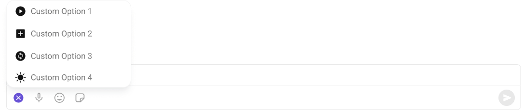
#### attachmentOptions
Override the default attachment options.
 ```tsx theme={null}
import { CometChat } from "@cometchat/chat-sdk-javascript";
import { CometChatMessageComposer } from "@cometchat/chat-uikit-react";
function ComposerCustomAttachments({ chatUser }: { chatUser: CometChat.User }) {
return (
openPhotoPicker() },
{ id: "file", title: "Document", iconURL: fileIcon, onClick: () => openFilePicker() },
]}
/>
);
}
```
Each custom option's `onClick` is a handler **you** implement — the composer only renders the menu. To send a message from a custom option, use the CometChat SDK or the UI Kit's [Event System](/ui-kit/react/event-system) (e.g. optimistic-send flows). Custom attachment options can also be provided by a [plugin](/ui-kit/react/plugins/overview); `sendTextMessageOverride` similarly lets you intercept the outgoing text before send.
#### auxiliaryButtonView
Replace the auxiliary button area.
```tsx theme={null}
import { CometChat } from "@cometchat/chat-sdk-javascript";
import { CometChatMessageComposer } from "@cometchat/chat-uikit-react";
function ComposerCustomAttachments({ chatUser }: { chatUser: CometChat.User }) {
return (
openPhotoPicker() },
{ id: "file", title: "Document", iconURL: fileIcon, onClick: () => openFilePicker() },
]}
/>
);
}
```
Each custom option's `onClick` is a handler **you** implement — the composer only renders the menu. To send a message from a custom option, use the CometChat SDK or the UI Kit's [Event System](/ui-kit/react/event-system) (e.g. optimistic-send flows). Custom attachment options can also be provided by a [plugin](/ui-kit/react/plugins/overview); `sendTextMessageOverride` similarly lets you intercept the outgoing text before send.
#### auxiliaryButtonView
Replace the auxiliary button area.
 ```tsx theme={null}
import { CometChat } from "@cometchat/chat-sdk-javascript";
import { CometChatMessageComposer, CometChatButton } from "@cometchat/chat-uikit-react";
function ComposerCustomAuxiliary({ chatUser }: { chatUser: CometChat.User }) {
return (
{}}>
}
/>
);
}
```
#### sendButtonView
Replace the send button.
```tsx theme={null}
import { CometChat } from "@cometchat/chat-sdk-javascript";
import { CometChatMessageComposer, CometChatButton } from "@cometchat/chat-uikit-react";
function ComposerCustomAuxiliary({ chatUser }: { chatUser: CometChat.User }) {
return (
{}}>
}
/>
);
}
```
#### sendButtonView
Replace the send button.
 ```tsx theme={null}
import { CometChat } from "@cometchat/chat-sdk-javascript";
import { CometChatMessageComposer, CometChatButton } from "@cometchat/chat-uikit-react";
function ComposerCustomSend({ chatUser }: { chatUser: CometChat.User }) {
return (
{}}>
}
/>
);
}
```
### Compound Composition
For full layout control, use sub-components. Omit any sub-component to hide it:
```tsx theme={null}
{/* No Header, EditPreview, or ReplyPreview — they won't render */}
```
Available sub-components:
| Sub-component | Description | Props | Flat API equivalent |
| ------------------ | ------------------------------ | --------------------------- | ------------------------------ |
| `Root` | Context provider and container | All Root props + `children` | — |
| `Input` | Text input area | `className` | — |
| `SendButton` | Send/edit button | `children`, `className` | `sendButtonView` (as children) |
| `AttachmentButton` | Attachment picker | `hideOptions`, `className` | `attachmentButtonIconView` |
| `EmojiButton` | Emoji keyboard toggle | `className` | `emojiButtonIconView` |
| `VoiceButton` | Voice recording toggle | `className` | `voiceRecordingButtonIconView` |
| `EditPreview` | Edit mode preview banner | `className` | — |
| `ReplyPreview` | Reply mode preview banner | `className` | — |
| `AuxiliaryButtons` | Custom auxiliary buttons | `children`, `className` | `auxiliaryButtonView` |
| `AIButton` | AI features toggle | `className` | — |
| `Header` | Header area | `children`, `className` | `headerView` |
| `Footer` | Footer area | `children`, `className` | — |
### CSS Styling
Override design tokens on the component selector:
```css theme={null}
.cometchat-message-composer {
--cometchat-background-color-01: #1a1a2e;
--cometchat-text-color-primary: #ffffff;
}
.cometchat-message-composer__input-area {
border-radius: 12px;
}
```
***
## Props
All props are optional unless noted.
View slot props (`headerView`, `sendButtonView`, `auxiliaryButtonView`, `attachmentButtonIconView`, `voiceRecordingButtonIconView`, `emojiButtonIconView`) are convenience props available only on the flat API. In compound composition mode, use the corresponding sub-components directly or pass children to them.
***
### Entity
The composer requires exactly one entity — a `user` (1:1) or a `group` — to know where to send messages. Without either prop it has no conversation to post to. For how to derive the active entity from a conversation/user/group selection and mount the composer, see the [New Chat Creation guide](/ui-kit/react/guide-new-chat-creation).
***
#### user
User for 1:1 conversations.
| | |
| ------- | ---------------- |
| Type | `CometChat.User` |
| Default | `undefined` |
***
#### group
Group for group conversations.
| | |
| ------- | ----------------- |
| Type | `CometChat.Group` |
| Default | `undefined` |
***
#### parentMessageId
Parent message ID for threaded replies.
| | |
| ------- | ----------- |
| Type | `number` |
| Default | `undefined` |
***
### Layout
***
#### layout
Layout mode for the composer. `compact` keeps everything on one line; `multiline` expands the input area.
| | |
| ------- | -------------------------- |
| Type | `'compact' \| 'multiline'` |
| Default | `'compact'` |
***
### Text Input
***
#### initialText
Initial text to pre-fill the input (uncontrolled).
| | |
| ------- | ----------- |
| Type | `string` |
| Default | `undefined` |
***
#### text
Controlled text value. When provided, the consumer owns the text state and must update it via `onTextChange`.
| | |
| ------- | ----------- |
| Type | `string` |
| Default | `undefined` |
***
#### placeholder
Placeholder text shown when the input is empty.
| | |
| ------- | --------------------- |
| Type | `string` |
| Default | `'Type a message...'` |
***
#### enterKeyBehavior
What happens when the user presses Enter.
| | |
| ------- | ------------------------------- |
| Type | `'send' \| 'newline' \| 'none'` |
| Default | `'send'` |
***
#### maxInputHeight
Maximum height for the input area in pixels before it scrolls.
| | |
| ------- | -------- |
| Type | `number` |
| Default | `200` |
***
### Rich Text
***
#### enableRichTextEditor
Enable rich text formatting (toolbar, keyboard shortcuts, markdown auto-conversion).
| | |
| ------- | --------- |
| Type | `boolean` |
| Default | `false` |
***
#### hideRichTextFormattingOptions
Hide the rich text formatting toolbar (shortcuts still work).
| | |
| ------- | --------- |
| Type | `boolean` |
| Default | `false` |
***
#### showBubbleMenuOnSelection
Show a floating bubble menu near selected text with formatting options (desktop only).
| | |
| ------- | --------- |
| Type | `boolean` |
| Default | `false` |
***
### Edit / Reply
***
#### messageToEdit
Message to edit (triggers edit mode).
| | |
| ------- | ------------------------------- |
| Type | `CometChat.TextMessage \| null` |
| Default | `null` |
***
#### messageToReply
Message to reply to (triggers reply mode with preview).
| | |
| ------- | ------------------------------- |
| Type | `CometChat.BaseMessage \| null` |
| Default | `null` |
***
### Attachments
**Extension-backed attachment options require a Dashboard extension.** The default attachment menu auto-integrates the **Polls**, **Collaborative Document**, **Collaborative Whiteboard**, and **Sticker** options — but each only appears once its extension is enabled in the [CometChat Dashboard](/ui-kit/react/extensions). If an option is missing, enable the extension: [Polls](/fundamentals/polls), [Collaborative Document](/fundamentals/collaborative-document), [Collaborative Whiteboard](/fundamentals/collaborative-whiteboard), [Stickers](/fundamentals/stickers). See [Extensions](/ui-kit/react/extensions) for the full list of extensions the composer auto-integrates. `hideAttachmentOptions` and `hideStickersButton` only control visibility of options that are already enabled.
***
#### attachmentOptions
Custom attachment options (overrides plugin-provided ones).
| | |
| ------- | ------------------------------------- |
| Type | `CometChatComposerAttachmentOption[]` |
| Default | `undefined` |
***
#### hideAttachmentOptions
Hide specific attachment options in the default layout.
| | |
| ------- | -------------------------------- |
| Type | `CometChatAttachmentHideOptions` |
| Default | `undefined` |
```tsx theme={null}
```
***
#### showAttachmentPreview
Whether to show attachment preview thumbnails before sending.
| | |
| ------- | --------- |
| Type | `boolean` |
| Default | `true` |
***
#### enableMultipleAttachments
Enable multi-attachment staging tray and batch send. When `true` (default), selecting an attachment option stages files in a tray for a single batched send. When `false`, each attachment option reverts to legacy single-select, send-immediately behavior.
| | |
| ------- | --------- |
| Type | `boolean` |
| Default | `true` |
***
#### disableDragAndDrop
Disable drag-and-drop file upload on the composer.
| | |
| ------- | --------- |
| Type | `boolean` |
| Default | `false` |
***
#### allowedFileTypes
Allowed file MIME types for attachments.
| | |
| ------- | ------------------------------- |
| Type | `string[]` |
| Default | `undefined` (all types allowed) |
***
### Hide Buttons
***
#### hideAttachmentButton
Hide the attachment ("+") button entirely.
| | |
| ------- | --------- |
| Type | `boolean` |
| Default | `false` |
***
#### hideEmojiKeyboardButton
Hide the emoji keyboard button.
| | |
| ------- | --------- |
| Type | `boolean` |
| Default | `false` |
***
#### hideVoiceRecordingButton
Hide the voice recording button.
| | |
| ------- | --------- |
| Type | `boolean` |
| Default | `false` |
***
#### hideStickersButton
Hide the stickers button.
| | |
| ------- | --------- |
| Type | `boolean` |
| Default | `false` |
***
#### hideSendButton
Hide the send button.
| | |
| ------- | --------- |
| Type | `boolean` |
| Default | `false` |
***
#### hideError
Hide the error state UI.
| | |
| ------- | --------- |
| Type | `boolean` |
| Default | `false` |
***
### Mentions
***
#### textFormatters
Text formatters pipeline for custom text processing.
| | |
| ------- | -------------------------- |
| Type | `CometChatTextFormatter[]` |
| Default | `undefined` |
***
#### disableMentions
Disable @mentions entirely.
| | |
| ------- | --------- |
| Type | `boolean` |
| Default | `false` |
***
#### disableMentionAll
Disable the @all mention option in groups.
| | |
| ------- | --------- |
| Type | `boolean` |
| Default | `false` |
***
#### mentionAllLabel
Label for the @all mention option.
| | |
| ------- | -------- |
| Type | `string` |
| Default | `'all'` |
***
#### mentionsUsersRequestBuilder
Custom request builder for mention user search.
| | |
| ------- | ------------------------------- |
| Type | `CometChat.UsersRequestBuilder` |
| Default | `undefined` |
***
#### mentionsGroupMembersRequestBuilder
Custom request builder for mention group member search.
| | |
| ------- | -------------------------------------- |
| Type | `CometChat.GroupMembersRequestBuilder` |
| Default | `undefined` |
***
### Sound
***
#### disableTypingEvents
Disable typing indicator events.
| | |
| ------- | --------- |
| Type | `boolean` |
| Default | `false` |
***
#### disableSoundForMessage
Disable sound on message send.
| | |
| ------- | --------- |
| Type | `boolean` |
| Default | `false` |
***
#### customSoundForMessage
Custom sound URL for message send.
| | |
| ------- | ----------- |
| Type | `string` |
| Default | `undefined` |
***
### Misc
***
#### disableAutoFocusOnMobile
Disable auto-focus on mobile devices to prevent the keyboard from automatically opening on load.
| | |
| ------- | --------- |
| Type | `boolean` |
| Default | `true` |
***
#### liveReactionIcon
Custom icon URL for the live reaction button.
| | |
| ------- | ----------- |
| Type | `string` |
| Default | `undefined` |
***
#### showScrollbar
Show the native scrollbar on the input area.
| | |
| ------- | --------- |
| Type | `boolean` |
| Default | `false` |
***
### Custom Views
***
#### attachmentButtonIconView
Custom ReactNode to replace the content inside the attachment button (keeps action wired).
| | |
| ------- | ----------- |
| Type | `ReactNode` |
| Default | `undefined` |
***
#### voiceRecordingButtonIconView
Custom ReactNode to replace the content inside the voice recording button (keeps action wired).
| | |
| ------- | ----------- |
| Type | `ReactNode` |
| Default | `undefined` |
***
#### emojiButtonIconView
Custom ReactNode to replace the content inside the emoji button (keeps action wired).
| | |
| ------- | ----------- |
| Type | `ReactNode` |
| Default | `undefined` |
***
#### sendButtonView
Custom ReactNode to replace the content inside the send button (keeps send/edit action wired).
| | |
| ------- | ----------- |
| Type | `ReactNode` |
| Default | `undefined` |
***
#### auxiliaryButtonView
Custom ReactNode for additional buttons rendered in the actions area before the send button.
| | |
| ------- | ----------- |
| Type | `ReactNode` |
| Default | `undefined` |
***
#### headerView
Custom ReactNode for the header area above the input (replaces edit/reply preview + validation).
| | |
| ------- | ----------- |
| Type | `ReactNode` |
| Default | `undefined` |
***
### Callbacks
***
#### onTextChange
Called when text changes.
| | |
| ------- | ------------------------ |
| Type | `(text: string) => void` |
| Default | `undefined` |
***
#### onSendButtonClick
Called when a message is sent or edited.
| | |
| ------- | ------------------------------------------------------------------- |
| Type | `(message: CometChat.BaseMessage, mode?: 'send' \| 'edit') => void` |
| Default | `undefined` |
***
#### sendTextMessageOverride
Override the internal SDK sendTextMessage call for optimistic updates. When provided, called instead of `CometChat.sendMessage()`.
| | |
| ------- | ------------------------------------------------- |
| Type | `(text: string, richTextHtml?: string) => string` |
| Default | `undefined` |
***
#### onError
Called when an error occurs.
| | |
| ------- | -------------------------- |
| Type | `(error: unknown) => void` |
| Default | `undefined` |
***
#### onClosePreview
Called when reply/edit preview is closed.
| | |
| ------- | ------------ |
| Type | `() => void` |
| Default | `undefined` |
***
#### onAttachmentAdded
Called when a file attachment is added.
| | |
| ------- | ---------------------- |
| Type | `(file: File) => void` |
| Default | `undefined` |
***
#### onAttachmentRemoved
Called when a file attachment is removed.
| | |
| ------- | ---------------------- |
| Type | `(file: File) => void` |
| Default | `undefined` |
***
#### onMentionSelected
Called when a mention is selected from the suggestions list.
| | |
| ------- | --------------------------------------------------------- |
| Type | `(user: CometChat.User \| CometChat.GroupMember) => void` |
| Default | `undefined` |
***
## CSS Selectors
| Target | Selector |
| ---------------------------- | -------------------------------------------------------- |
| Root container | `.cometchat-message-composer` |
| Body wrapper | `.cometchat-message-composer__body` |
| Input area | `.cometchat-message-composer__input-area` |
| Actions bar | `.cometchat-message-composer__actions` |
| Attachment button | `.cometchat-message-composer__attachment-button-wrapper` |
| Emoji button | `.cometchat-message-composer__emoji-button-wrapper` |
| Voice button | `.cometchat-message-composer__voice-button-wrapper` |
| Send button | `.cometchat-message-composer__send-button-wrapper` |
| Sticker button | `.cometchat-message-composer__sticker-button-wrapper` |
| AI button | `.cometchat-message-composer__ai-button-wrapper` |
| Staging tray | `.cometchat-message-composer__tray` |
| Tray overlay (upload status) | `.cometchat-message-composer__tray-overlay` |
| Tray audio card body | `.cometchat-message-composer__tray-audio-body` |
| Tray audio name | `.cometchat-message-composer__tray-audio-name` |
| Tray audio slider | `.cometchat-message-composer__tray-audio-slider` |
| Tray audio time | `.cometchat-message-composer__tray-audio-time` |
| Tray retry button | `.cometchat-message-composer__tray-retry-button` |
| Tray rejected icon | `.cometchat-message-composer__tray-rejected-icon` |
| Drag-and-drop overlay | `.cometchat-message-composer__drop-zone` |
***
## Next Steps
Display messages for the selected conversation
Show threaded replies for a parent message
Customize colors, fonts, and spacing
```tsx theme={null}
import { CometChat } from "@cometchat/chat-sdk-javascript";
import { CometChatMessageComposer, CometChatButton } from "@cometchat/chat-uikit-react";
function ComposerCustomSend({ chatUser }: { chatUser: CometChat.User }) {
return (
{}}>
}
/>
);
}
```
### Compound Composition
For full layout control, use sub-components. Omit any sub-component to hide it:
```tsx theme={null}
{/* No Header, EditPreview, or ReplyPreview — they won't render */}
```
Available sub-components:
| Sub-component | Description | Props | Flat API equivalent |
| ------------------ | ------------------------------ | --------------------------- | ------------------------------ |
| `Root` | Context provider and container | All Root props + `children` | — |
| `Input` | Text input area | `className` | — |
| `SendButton` | Send/edit button | `children`, `className` | `sendButtonView` (as children) |
| `AttachmentButton` | Attachment picker | `hideOptions`, `className` | `attachmentButtonIconView` |
| `EmojiButton` | Emoji keyboard toggle | `className` | `emojiButtonIconView` |
| `VoiceButton` | Voice recording toggle | `className` | `voiceRecordingButtonIconView` |
| `EditPreview` | Edit mode preview banner | `className` | — |
| `ReplyPreview` | Reply mode preview banner | `className` | — |
| `AuxiliaryButtons` | Custom auxiliary buttons | `children`, `className` | `auxiliaryButtonView` |
| `AIButton` | AI features toggle | `className` | — |
| `Header` | Header area | `children`, `className` | `headerView` |
| `Footer` | Footer area | `children`, `className` | — |
### CSS Styling
Override design tokens on the component selector:
```css theme={null}
.cometchat-message-composer {
--cometchat-background-color-01: #1a1a2e;
--cometchat-text-color-primary: #ffffff;
}
.cometchat-message-composer__input-area {
border-radius: 12px;
}
```
***
## Props
All props are optional unless noted.
View slot props (`headerView`, `sendButtonView`, `auxiliaryButtonView`, `attachmentButtonIconView`, `voiceRecordingButtonIconView`, `emojiButtonIconView`) are convenience props available only on the flat API. In compound composition mode, use the corresponding sub-components directly or pass children to them.
***
### Entity
The composer requires exactly one entity — a `user` (1:1) or a `group` — to know where to send messages. Without either prop it has no conversation to post to. For how to derive the active entity from a conversation/user/group selection and mount the composer, see the [New Chat Creation guide](/ui-kit/react/guide-new-chat-creation).
***
#### user
User for 1:1 conversations.
| | |
| ------- | ---------------- |
| Type | `CometChat.User` |
| Default | `undefined` |
***
#### group
Group for group conversations.
| | |
| ------- | ----------------- |
| Type | `CometChat.Group` |
| Default | `undefined` |
***
#### parentMessageId
Parent message ID for threaded replies.
| | |
| ------- | ----------- |
| Type | `number` |
| Default | `undefined` |
***
### Layout
***
#### layout
Layout mode for the composer. `compact` keeps everything on one line; `multiline` expands the input area.
| | |
| ------- | -------------------------- |
| Type | `'compact' \| 'multiline'` |
| Default | `'compact'` |
***
### Text Input
***
#### initialText
Initial text to pre-fill the input (uncontrolled).
| | |
| ------- | ----------- |
| Type | `string` |
| Default | `undefined` |
***
#### text
Controlled text value. When provided, the consumer owns the text state and must update it via `onTextChange`.
| | |
| ------- | ----------- |
| Type | `string` |
| Default | `undefined` |
***
#### placeholder
Placeholder text shown when the input is empty.
| | |
| ------- | --------------------- |
| Type | `string` |
| Default | `'Type a message...'` |
***
#### enterKeyBehavior
What happens when the user presses Enter.
| | |
| ------- | ------------------------------- |
| Type | `'send' \| 'newline' \| 'none'` |
| Default | `'send'` |
***
#### maxInputHeight
Maximum height for the input area in pixels before it scrolls.
| | |
| ------- | -------- |
| Type | `number` |
| Default | `200` |
***
### Rich Text
***
#### enableRichTextEditor
Enable rich text formatting (toolbar, keyboard shortcuts, markdown auto-conversion).
| | |
| ------- | --------- |
| Type | `boolean` |
| Default | `false` |
***
#### hideRichTextFormattingOptions
Hide the rich text formatting toolbar (shortcuts still work).
| | |
| ------- | --------- |
| Type | `boolean` |
| Default | `false` |
***
#### showBubbleMenuOnSelection
Show a floating bubble menu near selected text with formatting options (desktop only).
| | |
| ------- | --------- |
| Type | `boolean` |
| Default | `false` |
***
### Edit / Reply
***
#### messageToEdit
Message to edit (triggers edit mode).
| | |
| ------- | ------------------------------- |
| Type | `CometChat.TextMessage \| null` |
| Default | `null` |
***
#### messageToReply
Message to reply to (triggers reply mode with preview).
| | |
| ------- | ------------------------------- |
| Type | `CometChat.BaseMessage \| null` |
| Default | `null` |
***
### Attachments
**Extension-backed attachment options require a Dashboard extension.** The default attachment menu auto-integrates the **Polls**, **Collaborative Document**, **Collaborative Whiteboard**, and **Sticker** options — but each only appears once its extension is enabled in the [CometChat Dashboard](/ui-kit/react/extensions). If an option is missing, enable the extension: [Polls](/fundamentals/polls), [Collaborative Document](/fundamentals/collaborative-document), [Collaborative Whiteboard](/fundamentals/collaborative-whiteboard), [Stickers](/fundamentals/stickers). See [Extensions](/ui-kit/react/extensions) for the full list of extensions the composer auto-integrates. `hideAttachmentOptions` and `hideStickersButton` only control visibility of options that are already enabled.
***
#### attachmentOptions
Custom attachment options (overrides plugin-provided ones).
| | |
| ------- | ------------------------------------- |
| Type | `CometChatComposerAttachmentOption[]` |
| Default | `undefined` |
***
#### hideAttachmentOptions
Hide specific attachment options in the default layout.
| | |
| ------- | -------------------------------- |
| Type | `CometChatAttachmentHideOptions` |
| Default | `undefined` |
```tsx theme={null}
```
***
#### showAttachmentPreview
Whether to show attachment preview thumbnails before sending.
| | |
| ------- | --------- |
| Type | `boolean` |
| Default | `true` |
***
#### enableMultipleAttachments
Enable multi-attachment staging tray and batch send. When `true` (default), selecting an attachment option stages files in a tray for a single batched send. When `false`, each attachment option reverts to legacy single-select, send-immediately behavior.
| | |
| ------- | --------- |
| Type | `boolean` |
| Default | `true` |
***
#### disableDragAndDrop
Disable drag-and-drop file upload on the composer.
| | |
| ------- | --------- |
| Type | `boolean` |
| Default | `false` |
***
#### allowedFileTypes
Allowed file MIME types for attachments.
| | |
| ------- | ------------------------------- |
| Type | `string[]` |
| Default | `undefined` (all types allowed) |
***
### Hide Buttons
***
#### hideAttachmentButton
Hide the attachment ("+") button entirely.
| | |
| ------- | --------- |
| Type | `boolean` |
| Default | `false` |
***
#### hideEmojiKeyboardButton
Hide the emoji keyboard button.
| | |
| ------- | --------- |
| Type | `boolean` |
| Default | `false` |
***
#### hideVoiceRecordingButton
Hide the voice recording button.
| | |
| ------- | --------- |
| Type | `boolean` |
| Default | `false` |
***
#### hideStickersButton
Hide the stickers button.
| | |
| ------- | --------- |
| Type | `boolean` |
| Default | `false` |
***
#### hideSendButton
Hide the send button.
| | |
| ------- | --------- |
| Type | `boolean` |
| Default | `false` |
***
#### hideError
Hide the error state UI.
| | |
| ------- | --------- |
| Type | `boolean` |
| Default | `false` |
***
### Mentions
***
#### textFormatters
Text formatters pipeline for custom text processing.
| | |
| ------- | -------------------------- |
| Type | `CometChatTextFormatter[]` |
| Default | `undefined` |
***
#### disableMentions
Disable @mentions entirely.
| | |
| ------- | --------- |
| Type | `boolean` |
| Default | `false` |
***
#### disableMentionAll
Disable the @all mention option in groups.
| | |
| ------- | --------- |
| Type | `boolean` |
| Default | `false` |
***
#### mentionAllLabel
Label for the @all mention option.
| | |
| ------- | -------- |
| Type | `string` |
| Default | `'all'` |
***
#### mentionsUsersRequestBuilder
Custom request builder for mention user search.
| | |
| ------- | ------------------------------- |
| Type | `CometChat.UsersRequestBuilder` |
| Default | `undefined` |
***
#### mentionsGroupMembersRequestBuilder
Custom request builder for mention group member search.
| | |
| ------- | -------------------------------------- |
| Type | `CometChat.GroupMembersRequestBuilder` |
| Default | `undefined` |
***
### Sound
***
#### disableTypingEvents
Disable typing indicator events.
| | |
| ------- | --------- |
| Type | `boolean` |
| Default | `false` |
***
#### disableSoundForMessage
Disable sound on message send.
| | |
| ------- | --------- |
| Type | `boolean` |
| Default | `false` |
***
#### customSoundForMessage
Custom sound URL for message send.
| | |
| ------- | ----------- |
| Type | `string` |
| Default | `undefined` |
***
### Misc
***
#### disableAutoFocusOnMobile
Disable auto-focus on mobile devices to prevent the keyboard from automatically opening on load.
| | |
| ------- | --------- |
| Type | `boolean` |
| Default | `true` |
***
#### liveReactionIcon
Custom icon URL for the live reaction button.
| | |
| ------- | ----------- |
| Type | `string` |
| Default | `undefined` |
***
#### showScrollbar
Show the native scrollbar on the input area.
| | |
| ------- | --------- |
| Type | `boolean` |
| Default | `false` |
***
### Custom Views
***
#### attachmentButtonIconView
Custom ReactNode to replace the content inside the attachment button (keeps action wired).
| | |
| ------- | ----------- |
| Type | `ReactNode` |
| Default | `undefined` |
***
#### voiceRecordingButtonIconView
Custom ReactNode to replace the content inside the voice recording button (keeps action wired).
| | |
| ------- | ----------- |
| Type | `ReactNode` |
| Default | `undefined` |
***
#### emojiButtonIconView
Custom ReactNode to replace the content inside the emoji button (keeps action wired).
| | |
| ------- | ----------- |
| Type | `ReactNode` |
| Default | `undefined` |
***
#### sendButtonView
Custom ReactNode to replace the content inside the send button (keeps send/edit action wired).
| | |
| ------- | ----------- |
| Type | `ReactNode` |
| Default | `undefined` |
***
#### auxiliaryButtonView
Custom ReactNode for additional buttons rendered in the actions area before the send button.
| | |
| ------- | ----------- |
| Type | `ReactNode` |
| Default | `undefined` |
***
#### headerView
Custom ReactNode for the header area above the input (replaces edit/reply preview + validation).
| | |
| ------- | ----------- |
| Type | `ReactNode` |
| Default | `undefined` |
***
### Callbacks
***
#### onTextChange
Called when text changes.
| | |
| ------- | ------------------------ |
| Type | `(text: string) => void` |
| Default | `undefined` |
***
#### onSendButtonClick
Called when a message is sent or edited.
| | |
| ------- | ------------------------------------------------------------------- |
| Type | `(message: CometChat.BaseMessage, mode?: 'send' \| 'edit') => void` |
| Default | `undefined` |
***
#### sendTextMessageOverride
Override the internal SDK sendTextMessage call for optimistic updates. When provided, called instead of `CometChat.sendMessage()`.
| | |
| ------- | ------------------------------------------------- |
| Type | `(text: string, richTextHtml?: string) => string` |
| Default | `undefined` |
***
#### onError
Called when an error occurs.
| | |
| ------- | -------------------------- |
| Type | `(error: unknown) => void` |
| Default | `undefined` |
***
#### onClosePreview
Called when reply/edit preview is closed.
| | |
| ------- | ------------ |
| Type | `() => void` |
| Default | `undefined` |
***
#### onAttachmentAdded
Called when a file attachment is added.
| | |
| ------- | ---------------------- |
| Type | `(file: File) => void` |
| Default | `undefined` |
***
#### onAttachmentRemoved
Called when a file attachment is removed.
| | |
| ------- | ---------------------- |
| Type | `(file: File) => void` |
| Default | `undefined` |
***
#### onMentionSelected
Called when a mention is selected from the suggestions list.
| | |
| ------- | --------------------------------------------------------- |
| Type | `(user: CometChat.User \| CometChat.GroupMember) => void` |
| Default | `undefined` |
***
## CSS Selectors
| Target | Selector |
| ---------------------------- | -------------------------------------------------------- |
| Root container | `.cometchat-message-composer` |
| Body wrapper | `.cometchat-message-composer__body` |
| Input area | `.cometchat-message-composer__input-area` |
| Actions bar | `.cometchat-message-composer__actions` |
| Attachment button | `.cometchat-message-composer__attachment-button-wrapper` |
| Emoji button | `.cometchat-message-composer__emoji-button-wrapper` |
| Voice button | `.cometchat-message-composer__voice-button-wrapper` |
| Send button | `.cometchat-message-composer__send-button-wrapper` |
| Sticker button | `.cometchat-message-composer__sticker-button-wrapper` |
| AI button | `.cometchat-message-composer__ai-button-wrapper` |
| Staging tray | `.cometchat-message-composer__tray` |
| Tray overlay (upload status) | `.cometchat-message-composer__tray-overlay` |
| Tray audio card body | `.cometchat-message-composer__tray-audio-body` |
| Tray audio name | `.cometchat-message-composer__tray-audio-name` |
| Tray audio slider | `.cometchat-message-composer__tray-audio-slider` |
| Tray audio time | `.cometchat-message-composer__tray-audio-time` |
| Tray retry button | `.cometchat-message-composer__tray-retry-button` |
| Tray rejected icon | `.cometchat-message-composer__tray-rejected-icon` |
| Drag-and-drop overlay | `.cometchat-message-composer__drop-zone` |
***
## Next Steps
Display messages for the selected conversation
Show threaded replies for a parent message
Customize colors, fonts, and spacing